NOTES FROM ®.
Case studies in brand, type, packaging — and the work that makes people remember.
4 / 4
 ★ FeaturedN°01IDENTITY4 MIN
BUILDING ZARA’S EDITORIAL IDENTITY SYSTEM.
How we tightened a sprawling fashion identity into a single editorial system — type, palette, photography, and rules that scale to a hundred markets.
Read ↗ N°02BRANDING6 MIN
SUPERYOU: A WELLNESS BRAND WITH BITE.
Superyou wanted to look like a luxury brand and taste like a treat. We refused the usual wellness softness and built a chocolate-first identity instead.
Read ↗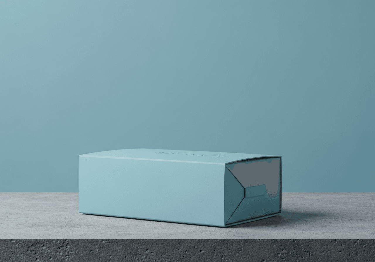 N°03PACKAGING5 MIN
DUREX PACKAGING THAT EARNS THE SECOND LOOK.
A category bound by red, glossy, shouty conventions. We did the opposite — and the box still got picked up.
Read ↗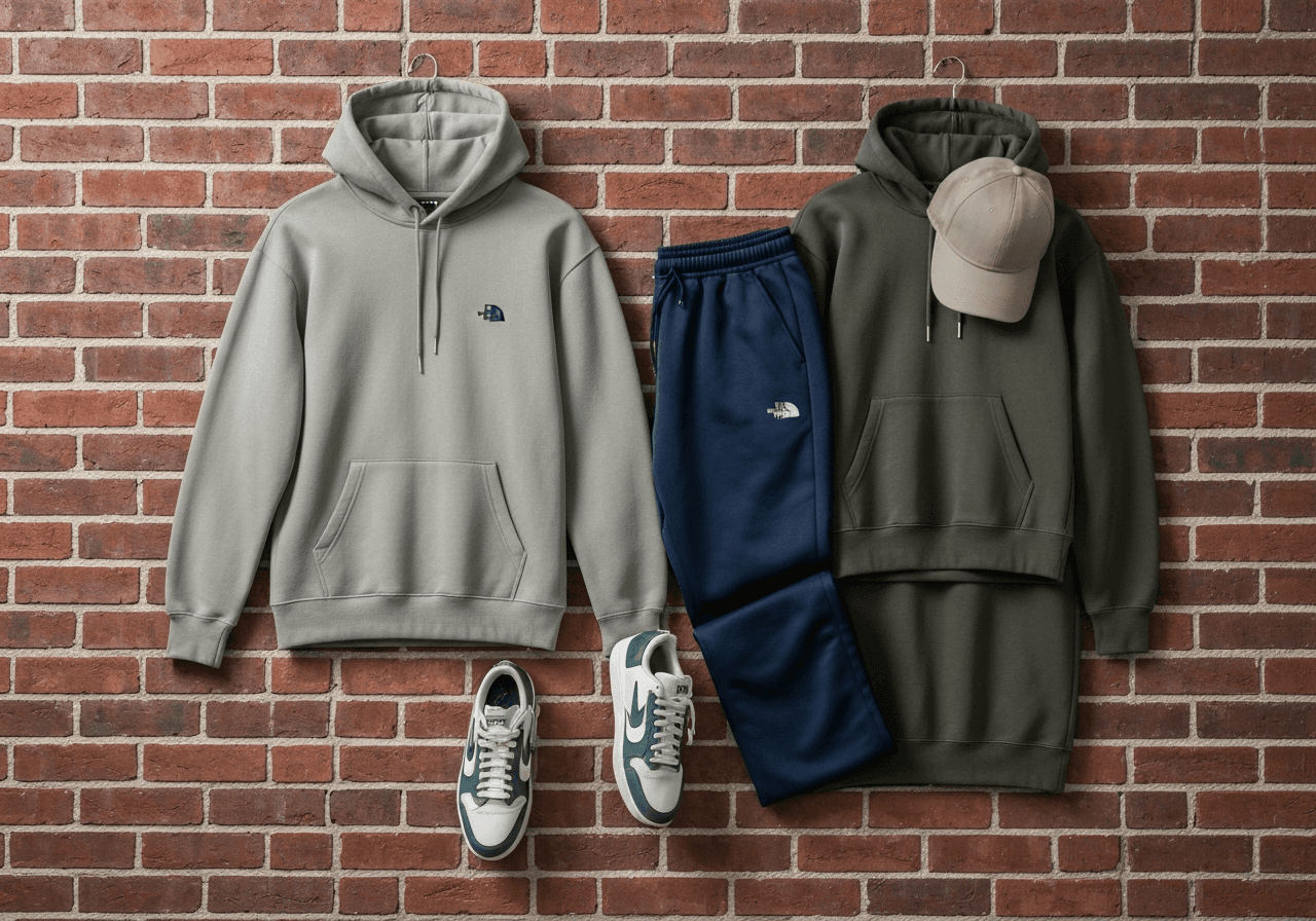 N°04STREETWEAR5 MIN
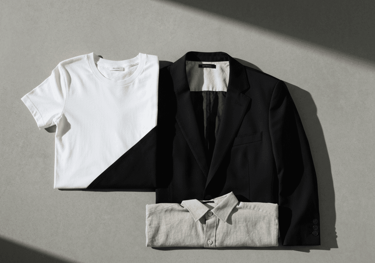
HOCCO: STREETWEAR THAT REFUSES TO BLEND IN.
Indian streetwear is dominated by either bro-hype or pastel safety. Hocco wanted neither. We built a brand for people who buy clothes to mean something.
Read ↗
FIELD NOTES,
NOT THINK-PIECES.
We publish slowly. Most posts here are dispatches from inside a live engagement — what we changed, why we changed it, and what it cost in arguments before we shipped.
Some are essays. Most are case studies. None of them are listicles. If you’re looking for ten quick tips, you’re in the wrong place; if you’re trying to figure out how a brand actually gets built when nobody’s posting about it, this is the right place.
Read in any order. Argue with us by email.