
Schweppes is 243 years old. It just got a redesign. And it looks better than ever.
Sometimes the boldest move in branding is refusing to look new.
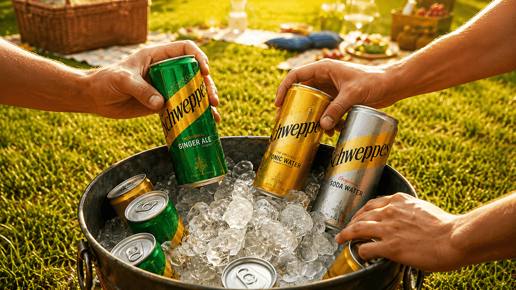
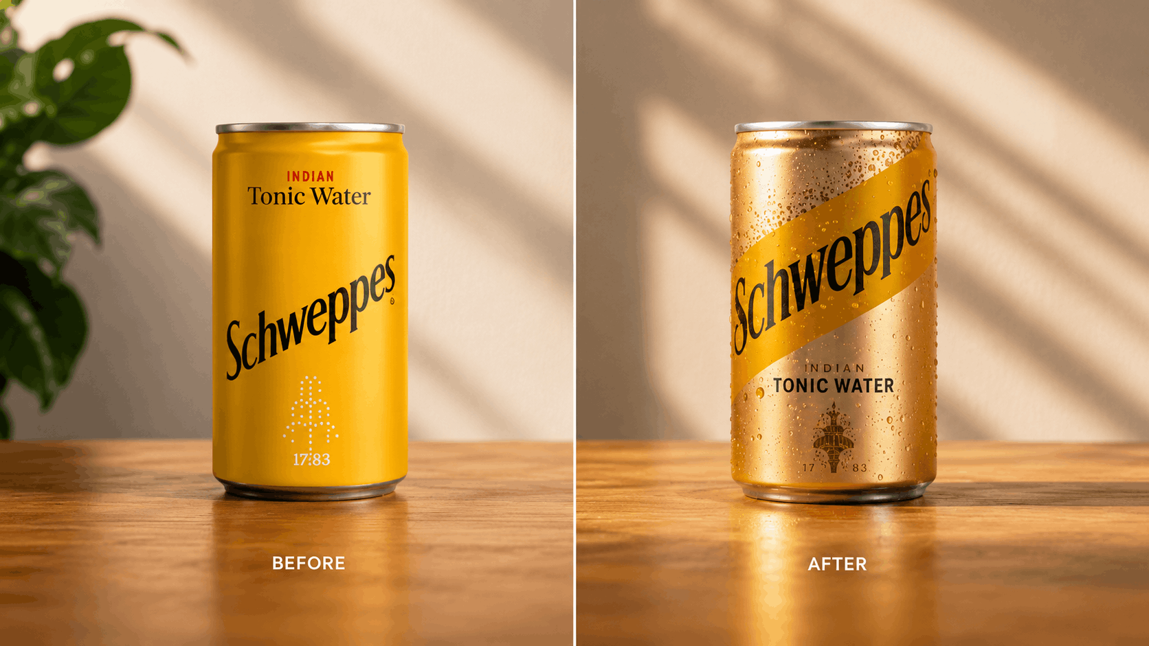
Schweppes’ latest redesign, by JKR, isn’t chasing contemporary. It’s the opposite, leaning further into 1780s history, refining the typography, deepening the iconic yellow, letting every decision reinforce heritage instead of replacing it.
No modern-design trend-chasing here. Just a quiet reminder that longevity itself is a luxury. Every detail says the same thing: this brand has earned its place.
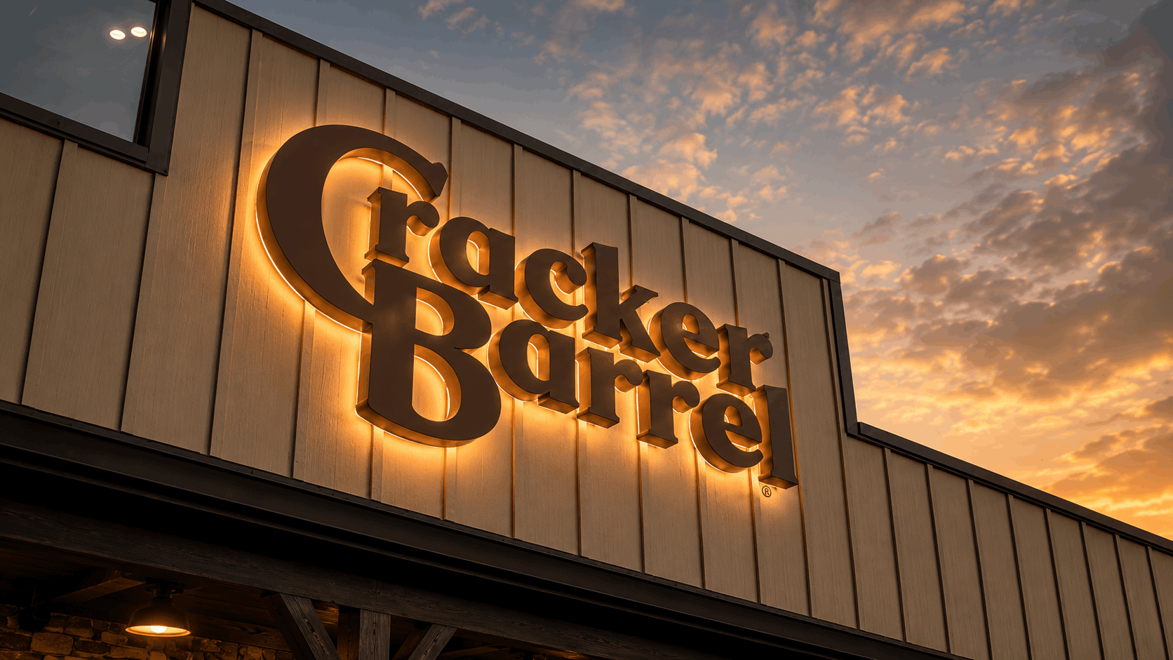
The strongest European brands don’t reinvent. They refine. Heineken still owns the red star it introduced in the 1800s. Lloyds Bank keeps building around its Black Horse. Lamborghini has modernised its identity several times and the bull has never once disappeared.
Indian brands often confuse modernity with removing character. The moment funding or an upmarket move arrives, the instinct is to simplify everything, regional type gone, colour flattened to neutral, packaging starting to resemble the same Pinterest board as everyone else’s. Cleaner, sure. Rarely more distinctive.
Heritage isn’t vintage type or a nostalgic palette. It’s built through consistency, repetition, and years of public memory. You can redesign a logo in a month. Reposition a business in a year. You cannot design two hundred years of trust.
History isn’t something to modernise away. It’s something to design around.
WHAT CLUNK® THINKS
Heritage isn’t old-fashioned. It’s an unfair advantage. The best redesigns don’t replace memory, they reinforce it. Every time a brand throws away its most recognisable assets chasing “modern,” it starts rebuilding recognition from zero.
The goal of a redesign was never to look new. It’s to make the brand feel timeless.
How does it land?

HAVE APROJECT IN MIND?LET’S TALK.
Tell us what you’re building and we’ll tell you, straight, what it could become. No pressure, just a real conversation about your brand.