
← All work
Case study2026Brand Identity
JUZU
Making real fruit feel bold, fresh, and expressive.
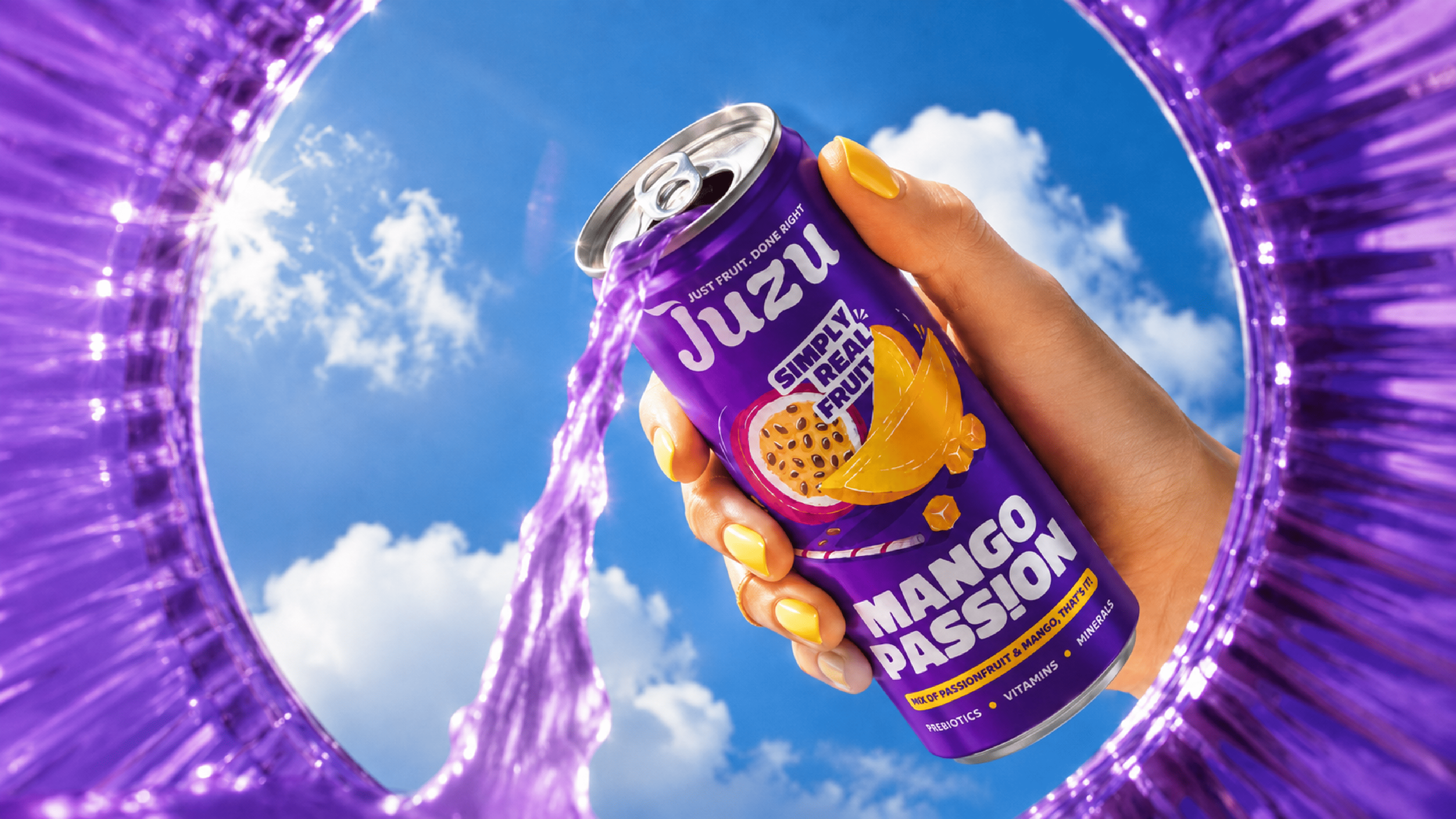
CRAFTING A PLAYFUL GEN Z JUICE IDENTITY FOR JUZU
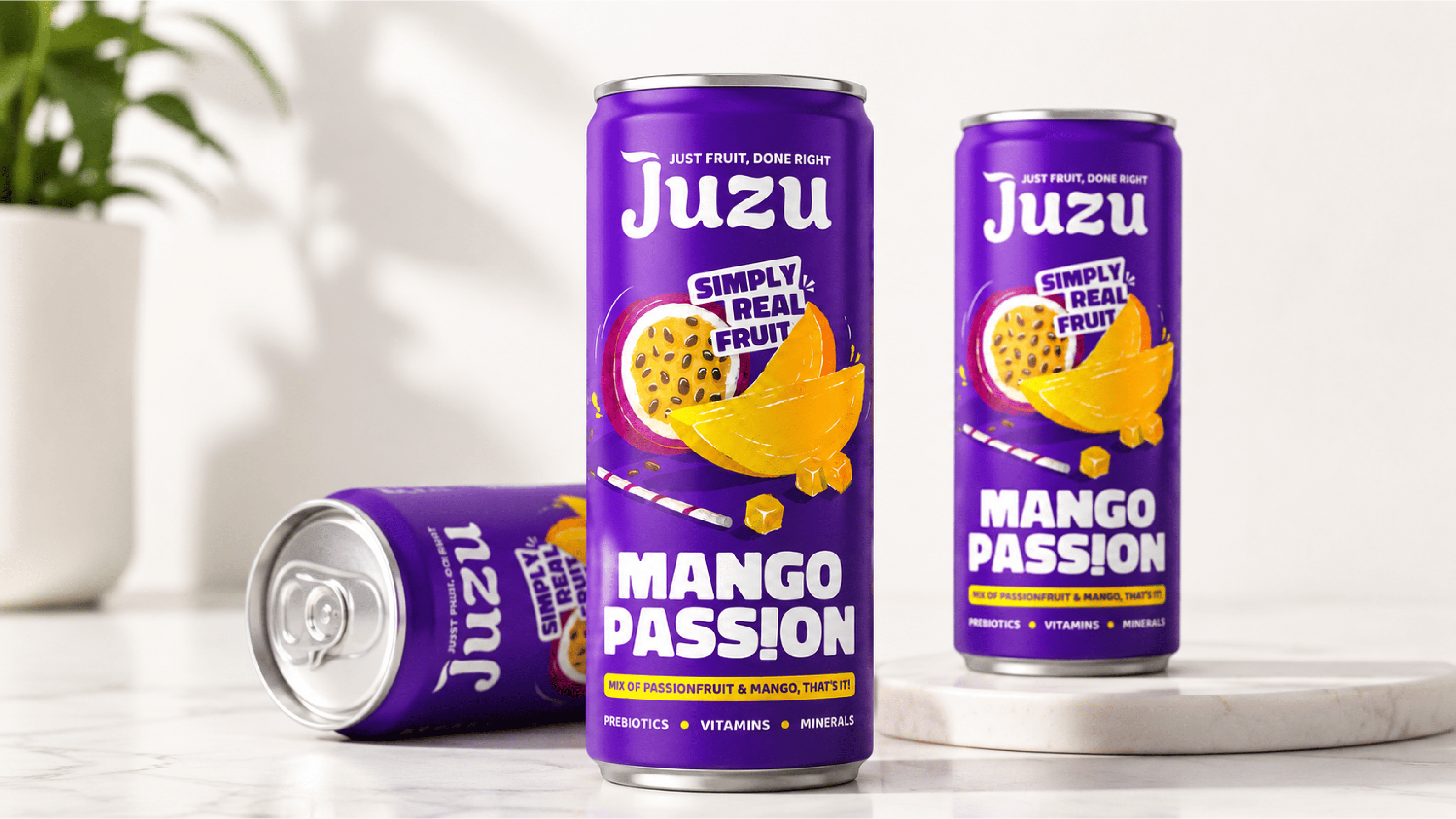
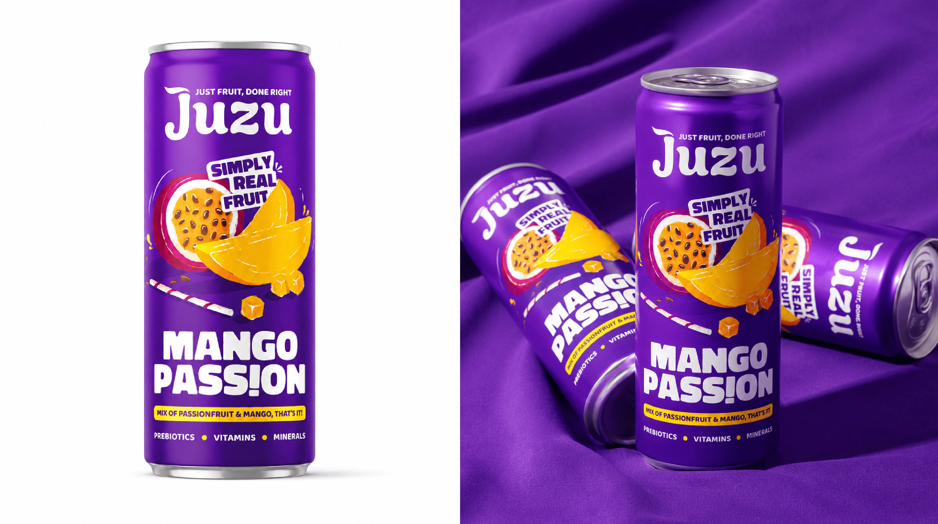
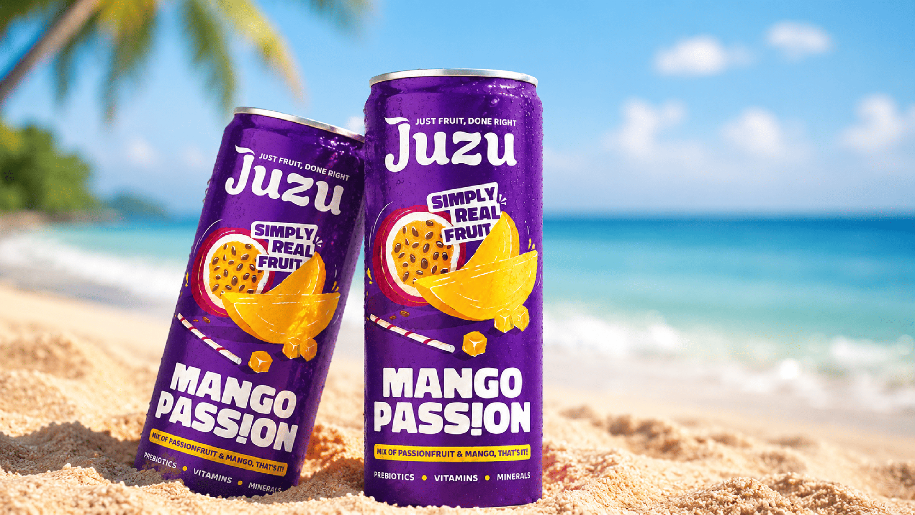
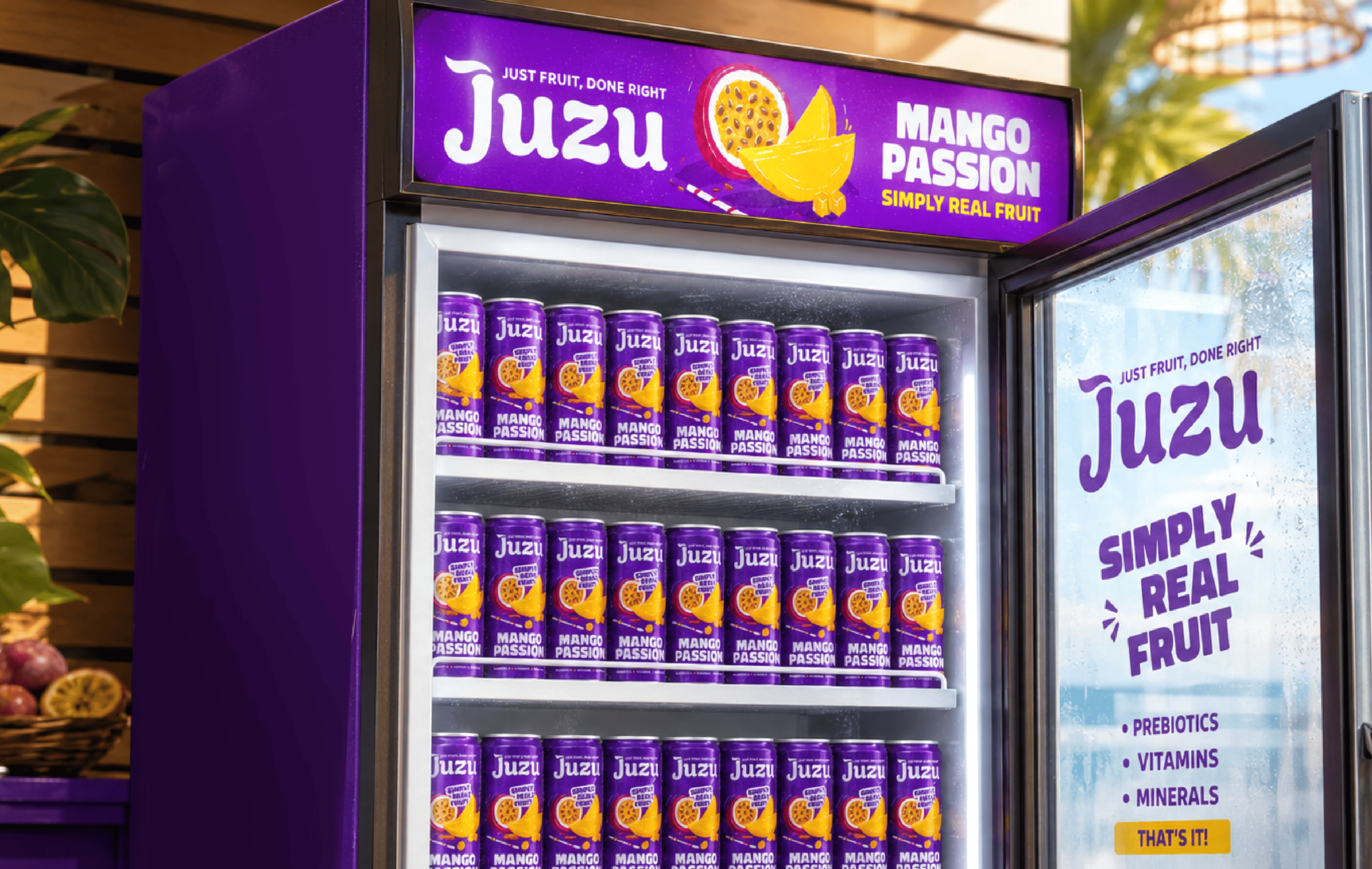
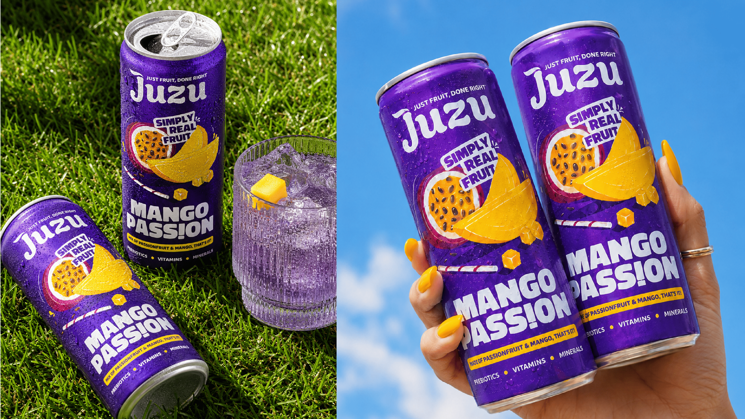
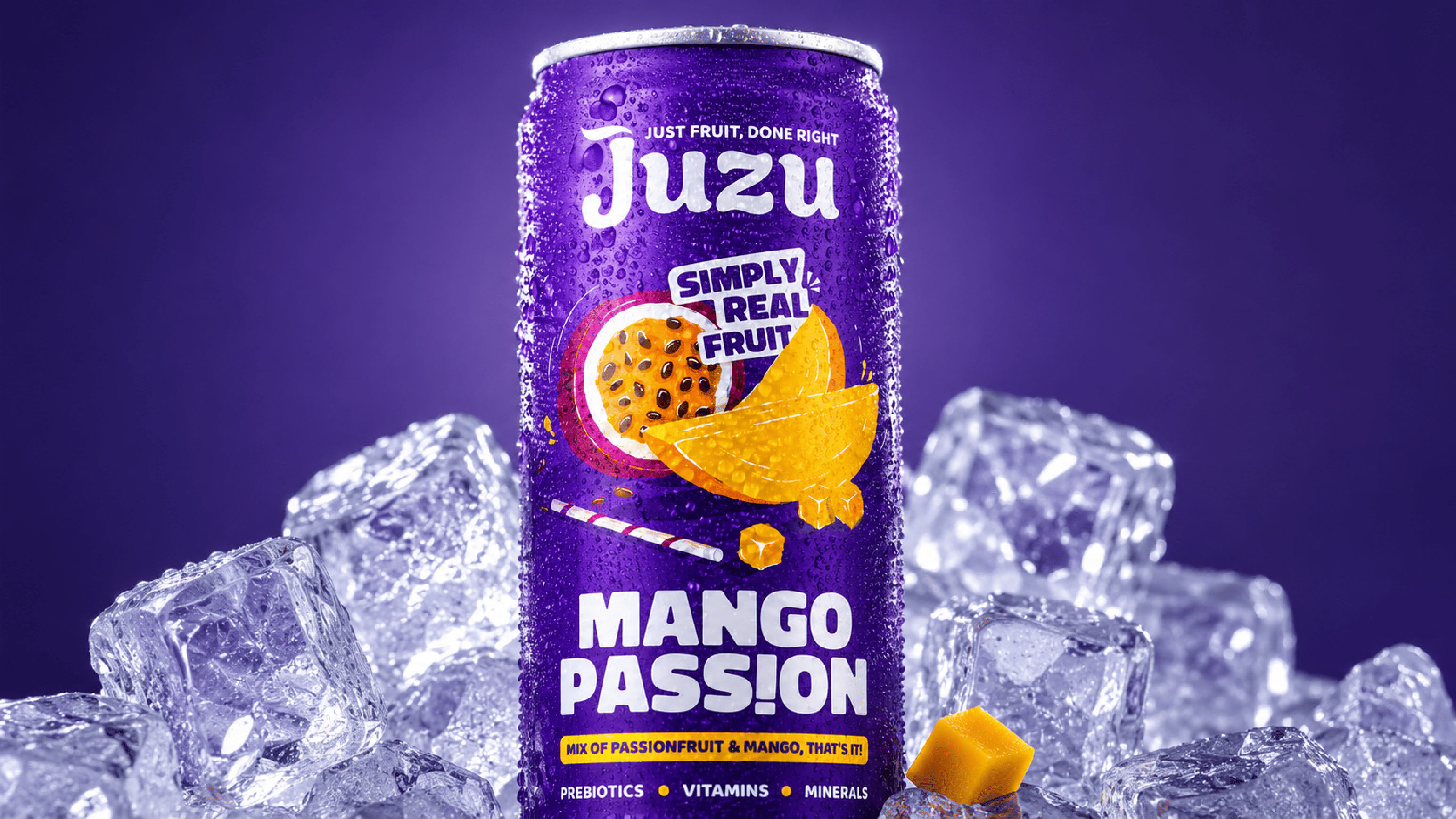
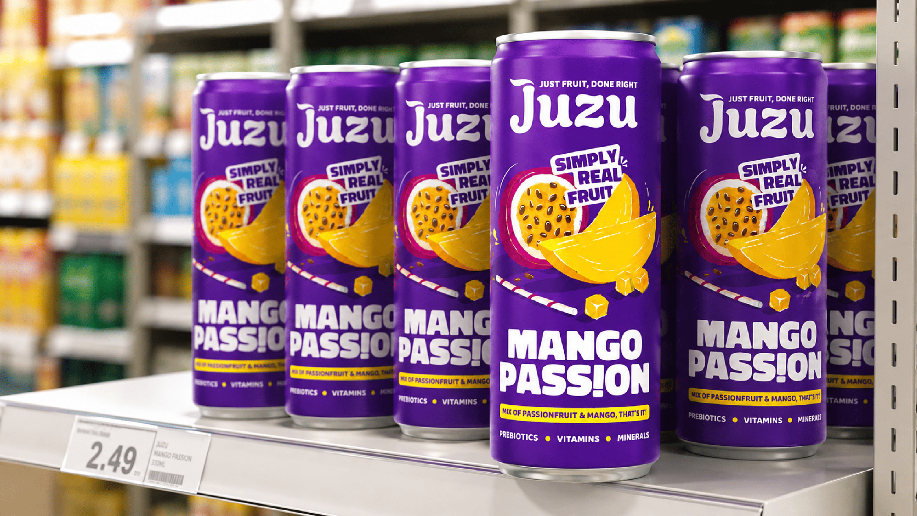
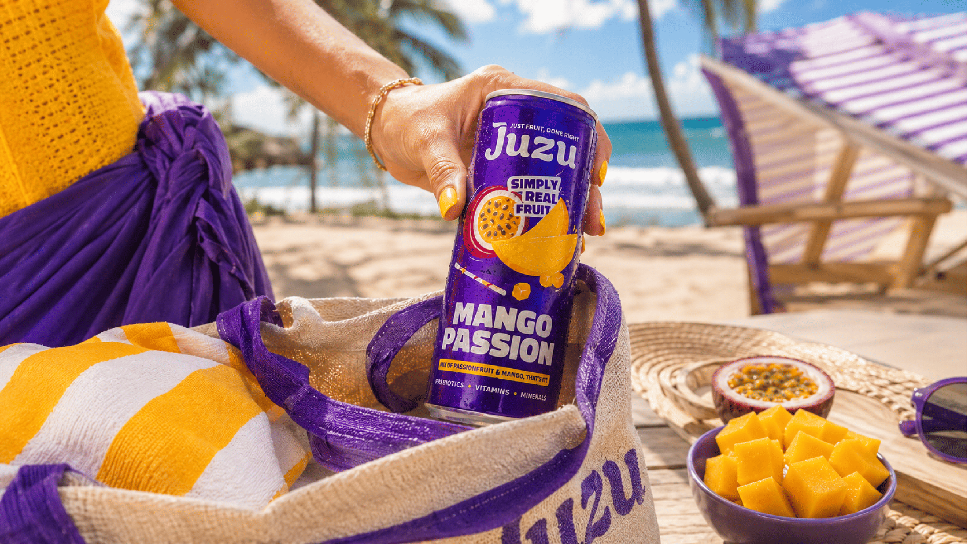
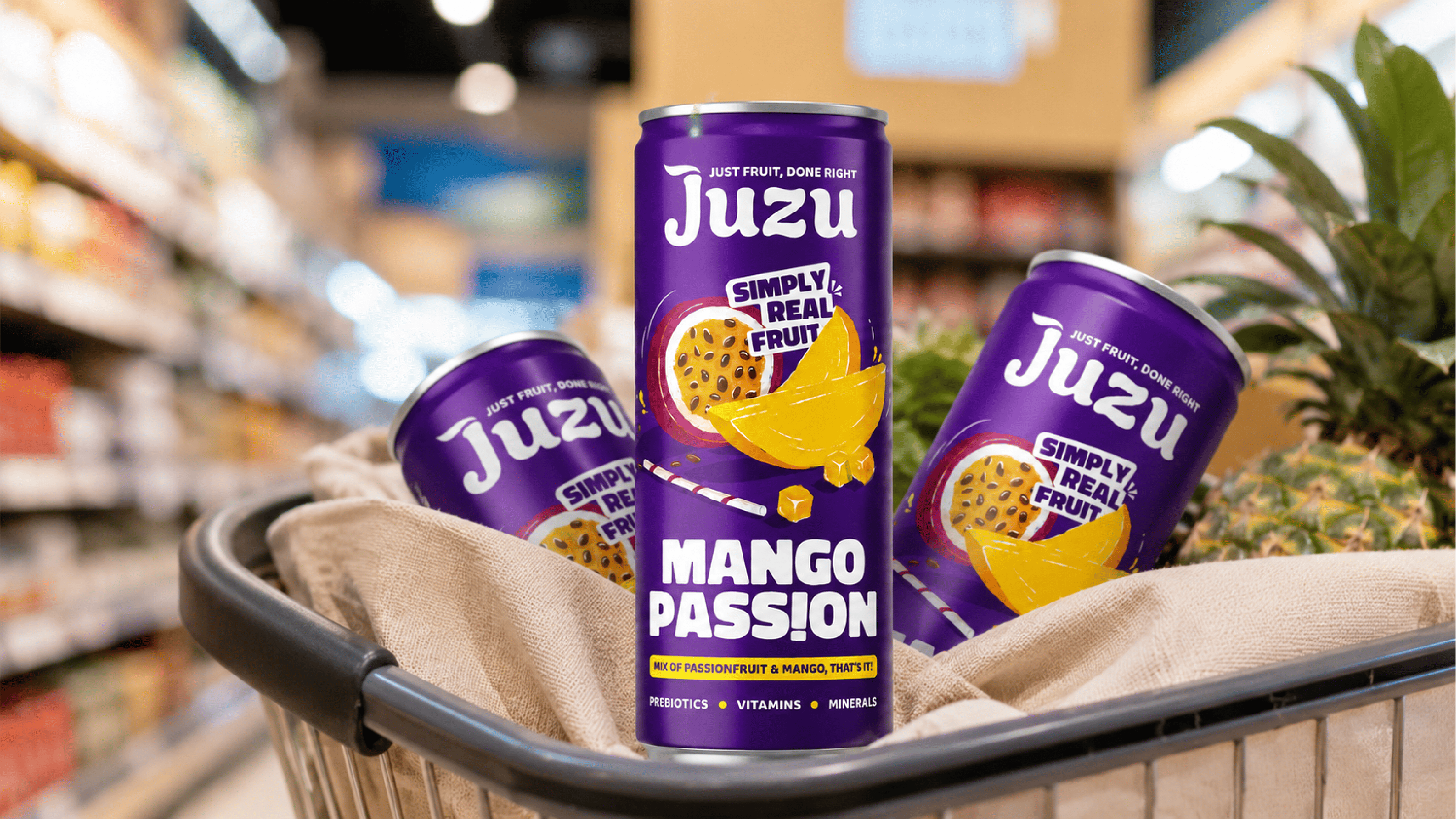
Juzu wanted to move beyond traditional juice packaging without looking like a fizzy drink. The brand needed a fun, poppy identity that could highlight real fruit, prebiotics, vitamins, and minerals while connecting with a younger audience.
We created a vibrant illustration-led system with handcrafted fruit graphics, a playful straw element, bold typography, and a prominent logo. The flexible master design can easily expand across future flavours while maintaining a strong and recognisable identity.
“Real fruit with a playful attitude for a new generation.”

Work with us
HAVE APROJECT IN MIND?LET’S TALK.
Tell us what you’re building and we’ll tell you, straight, what it could become. No pressure, just a real conversation about your brand.