
P POP
Playful intimacy, made bold and unforgettable.
CRAFTING A BOLD, PLAYFUL IDENTITY FOR P POP
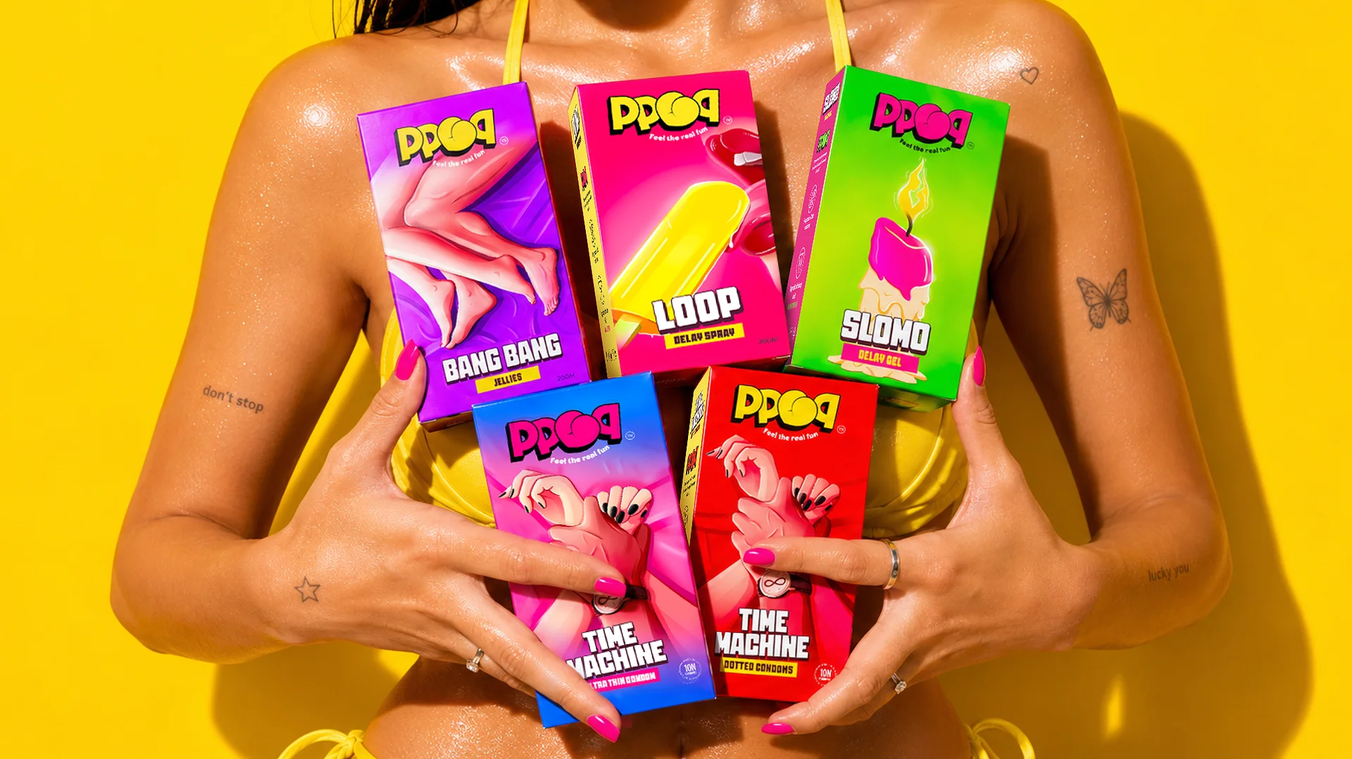
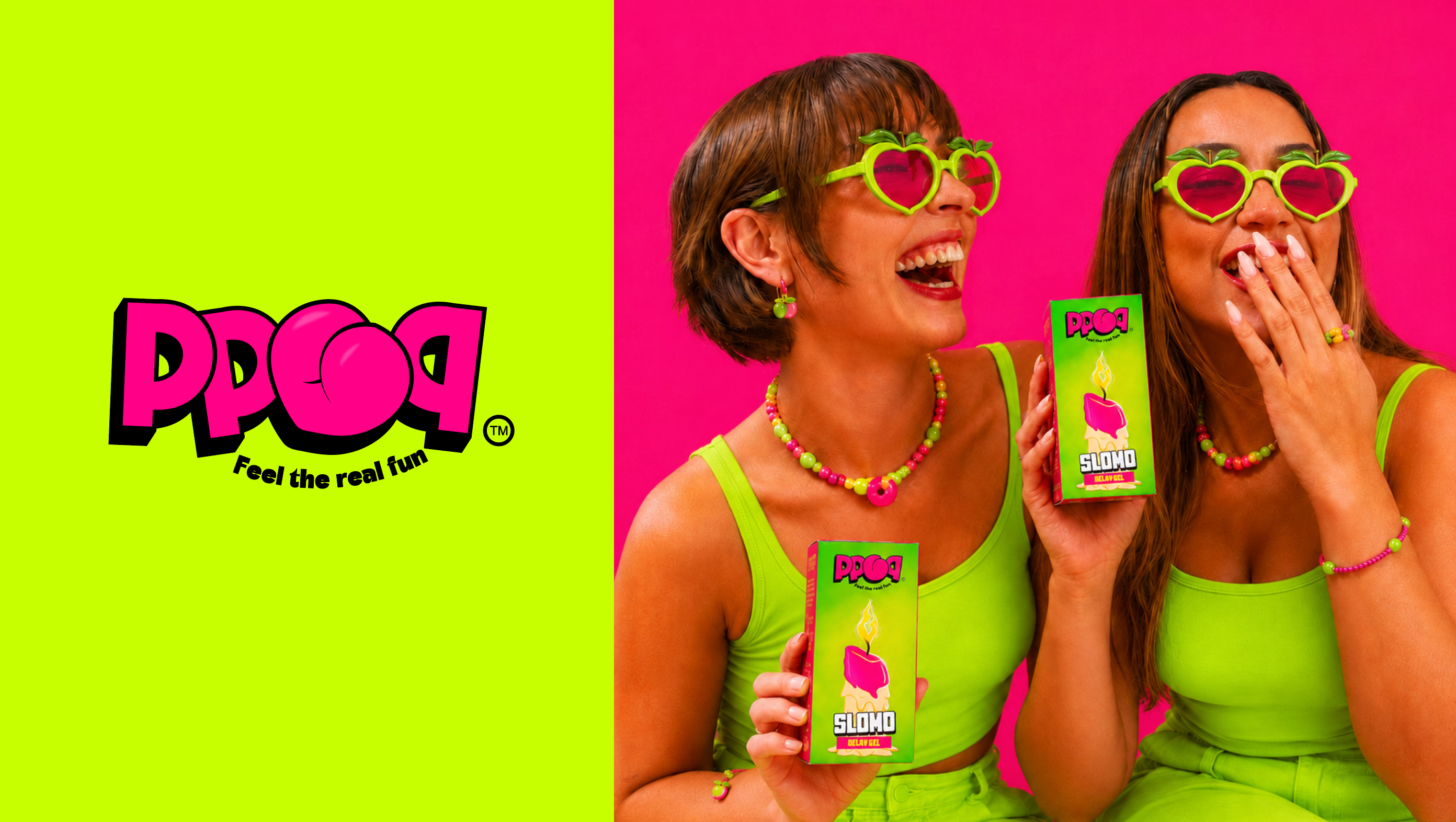
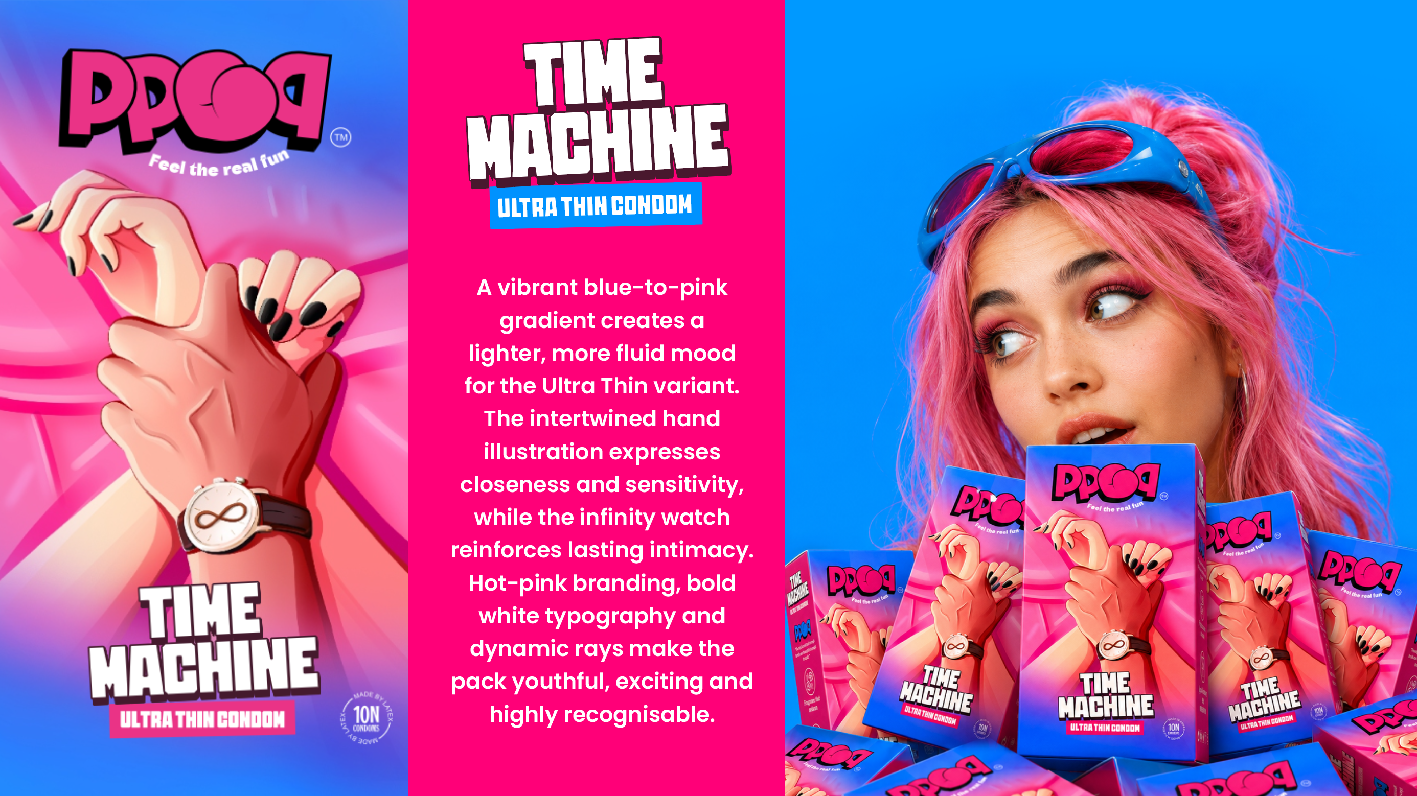
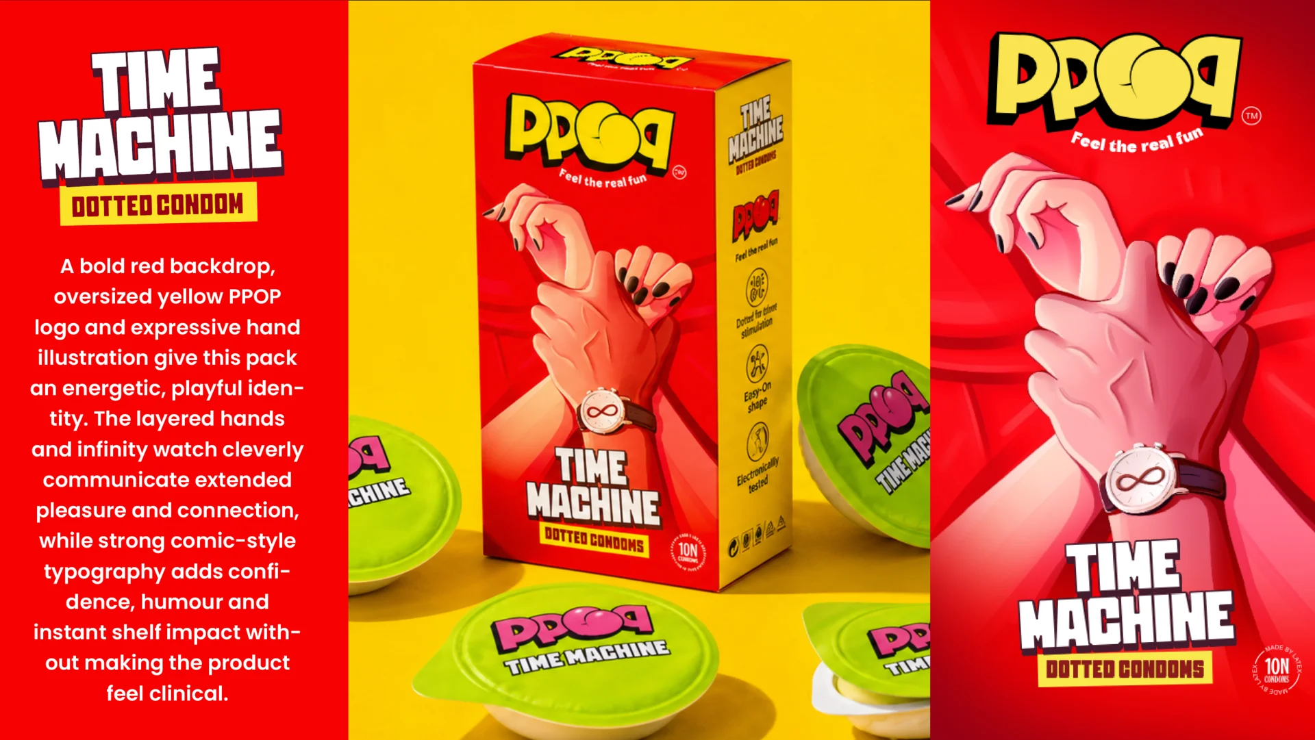
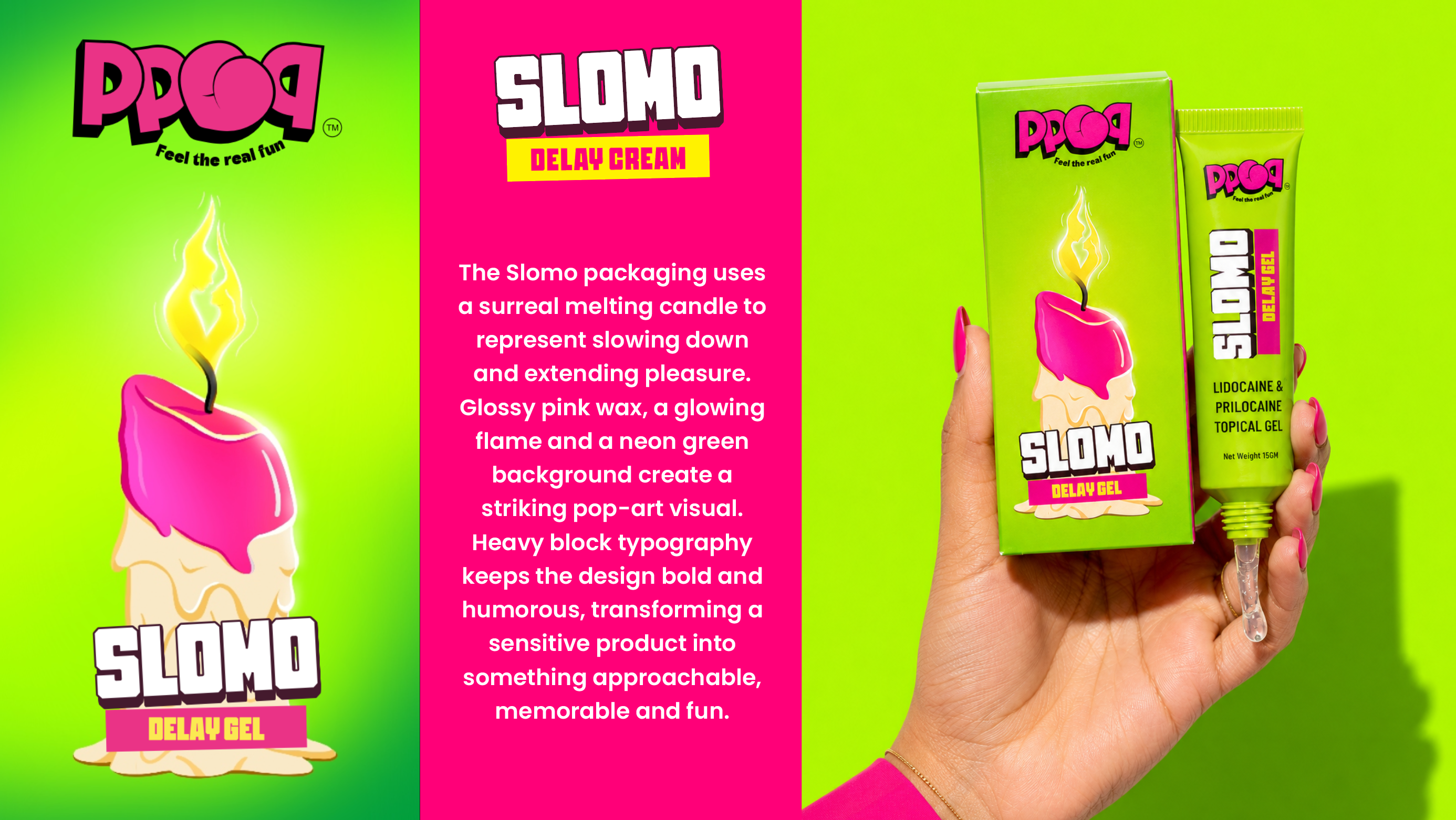
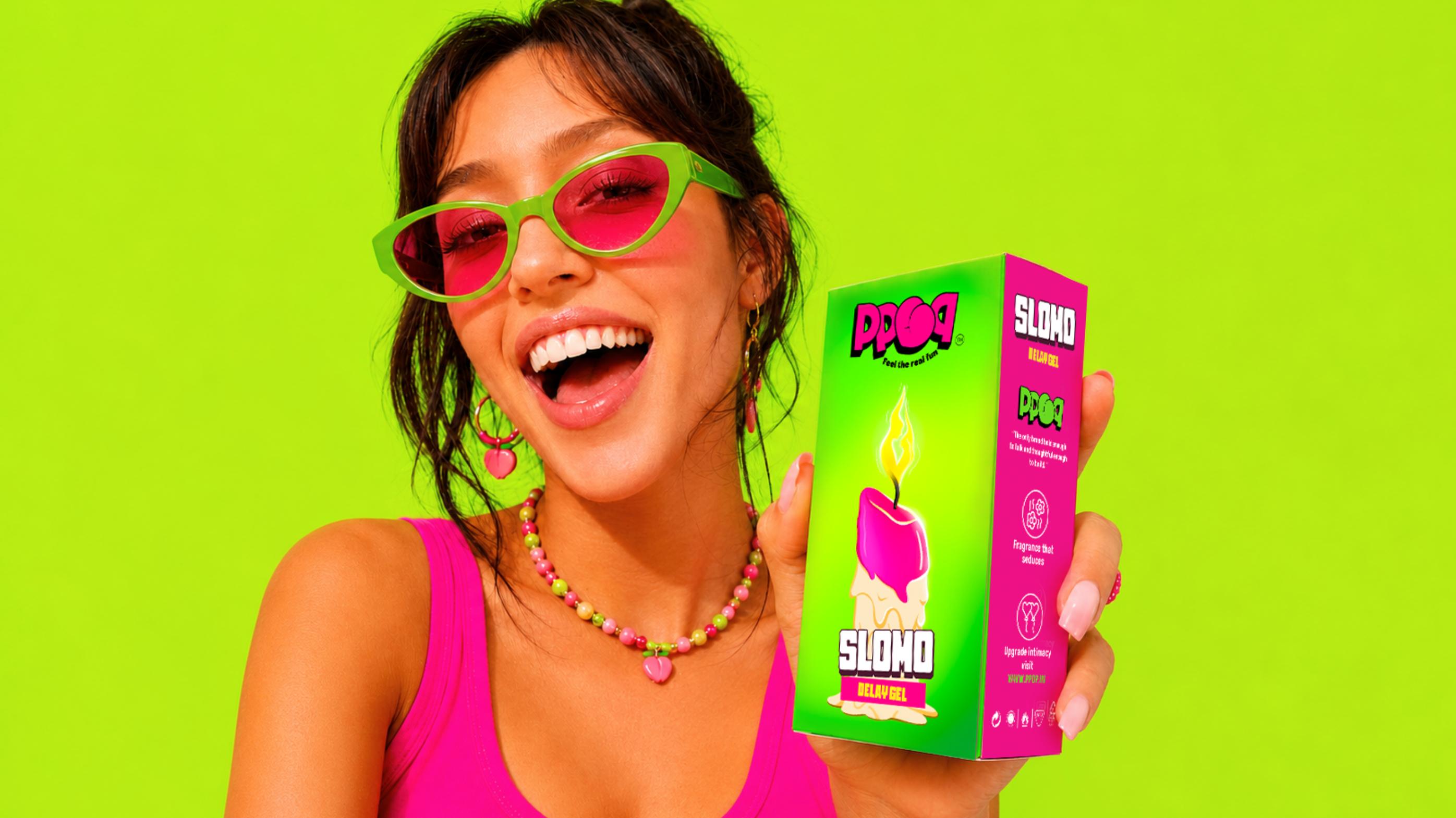
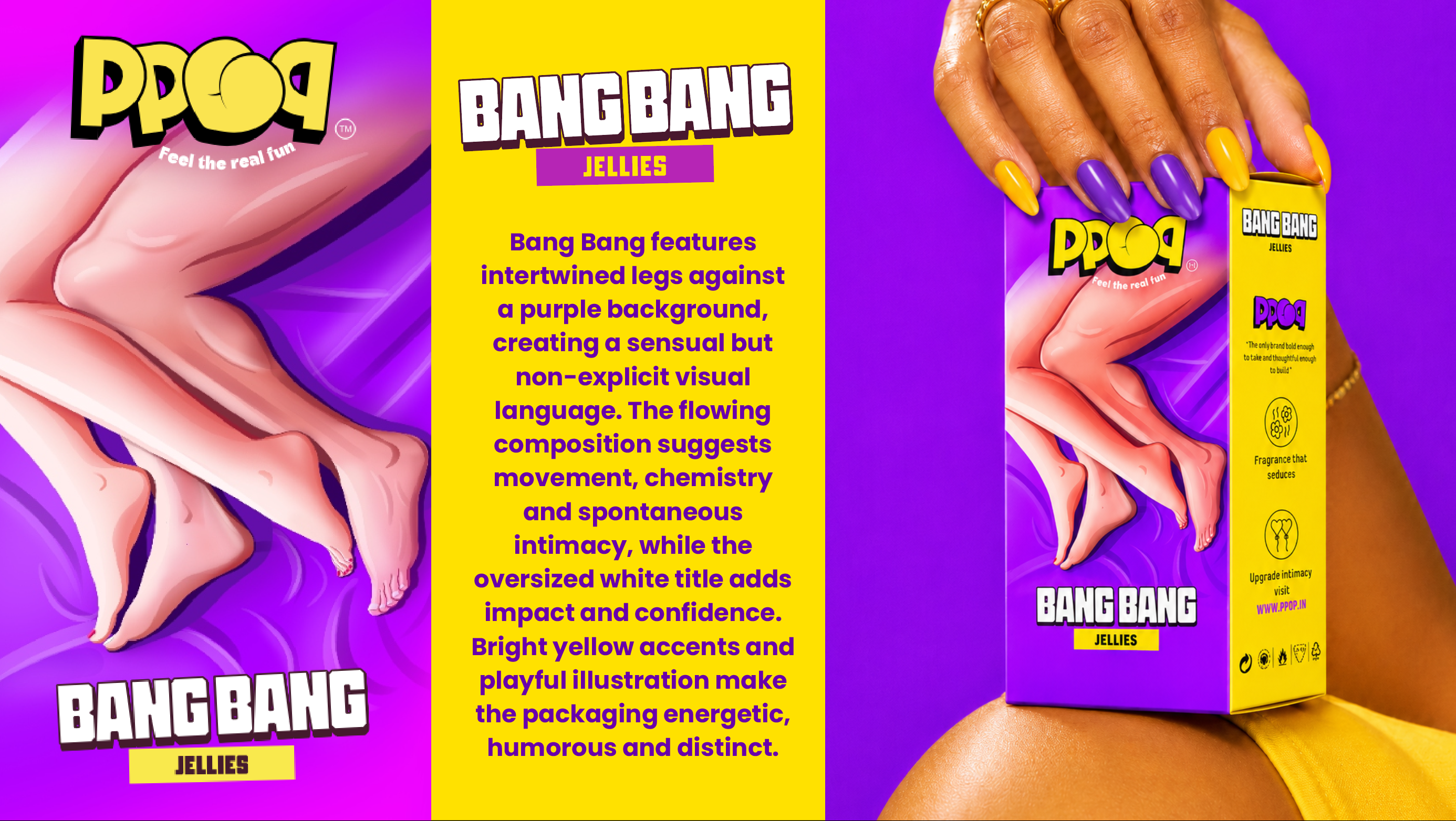
PPOP is a Gen Z men’s wellness brand created to challenge the awkward, clinical language traditionally associated with intimacy products. The category often relies on discreet packaging, predictable colours, and overly serious communication. PPOP needed an identity that could remove hesitation, spark curiosity, and make conversations around pleasure feel more open, relatable, and culturally relevant.
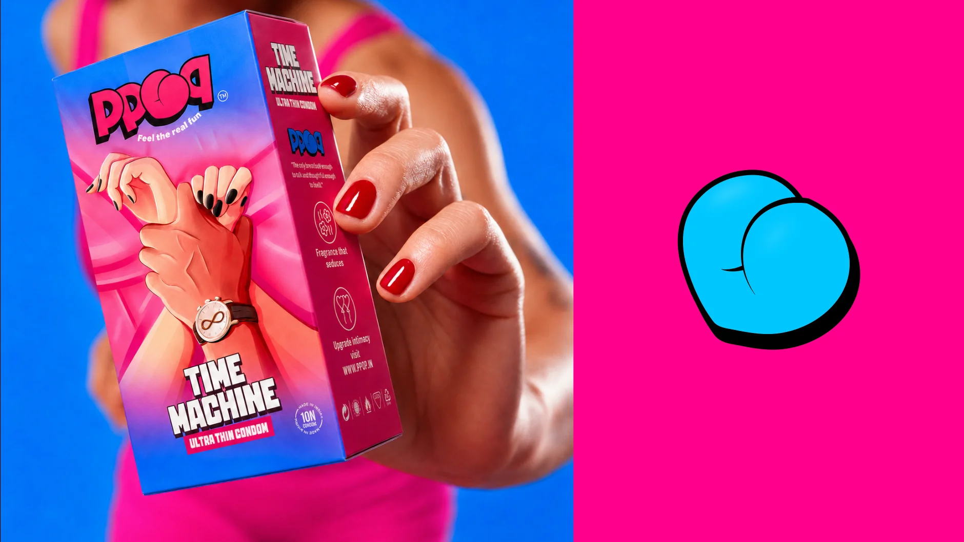
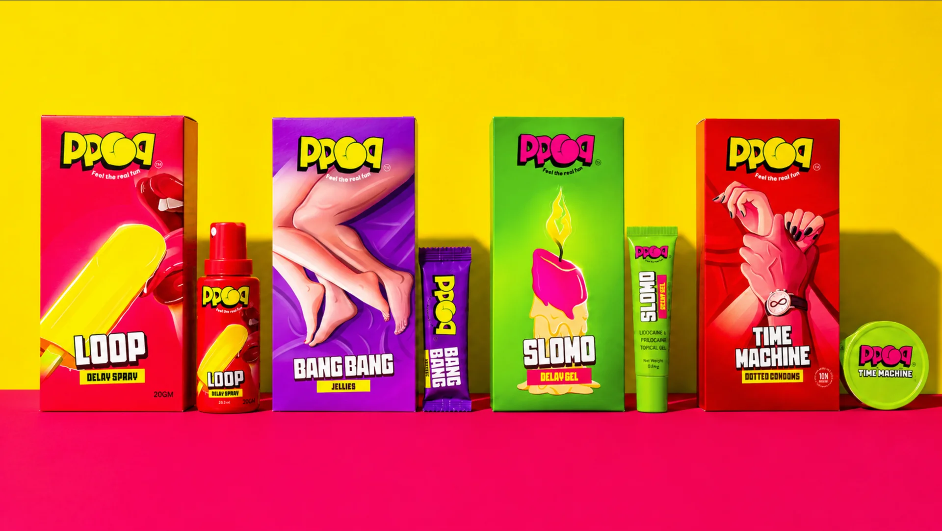
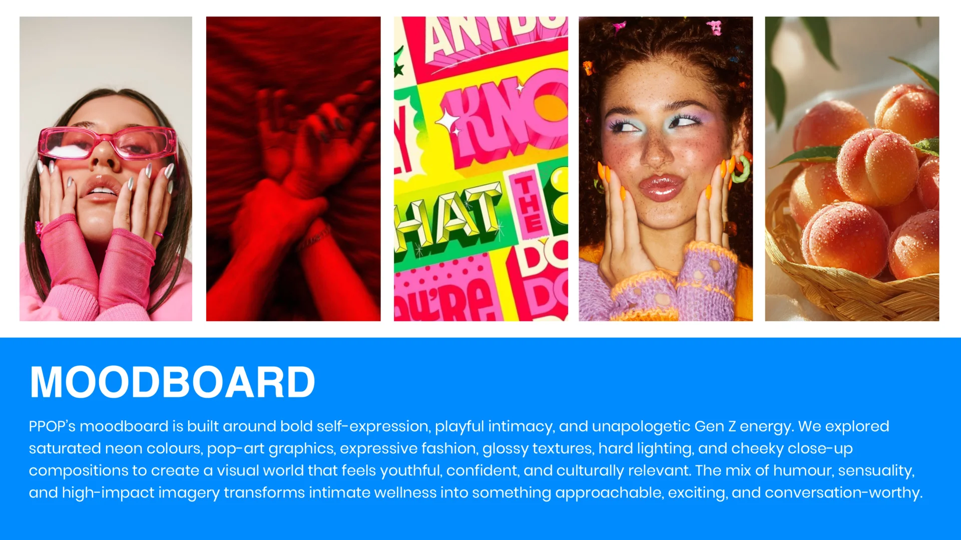
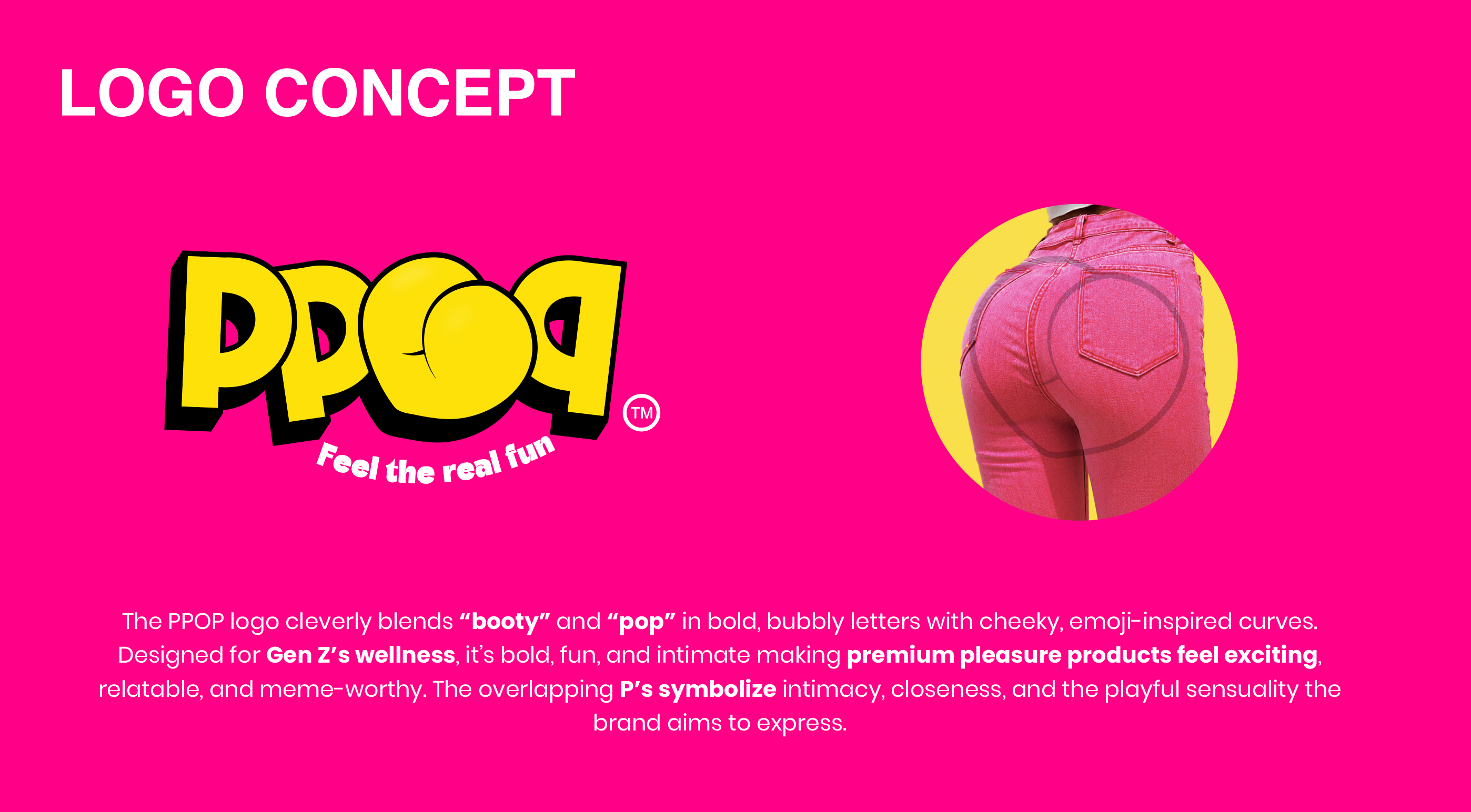
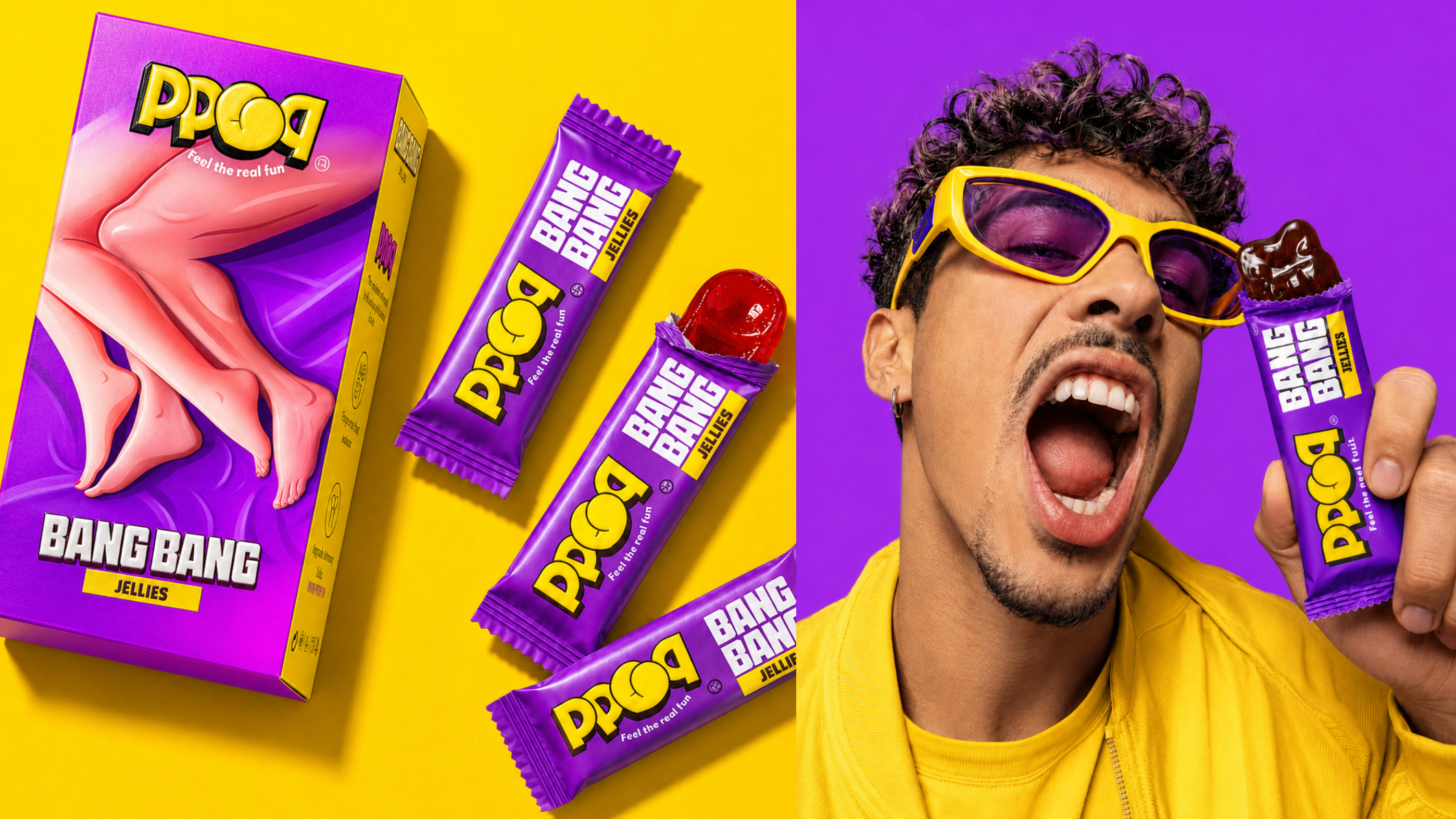
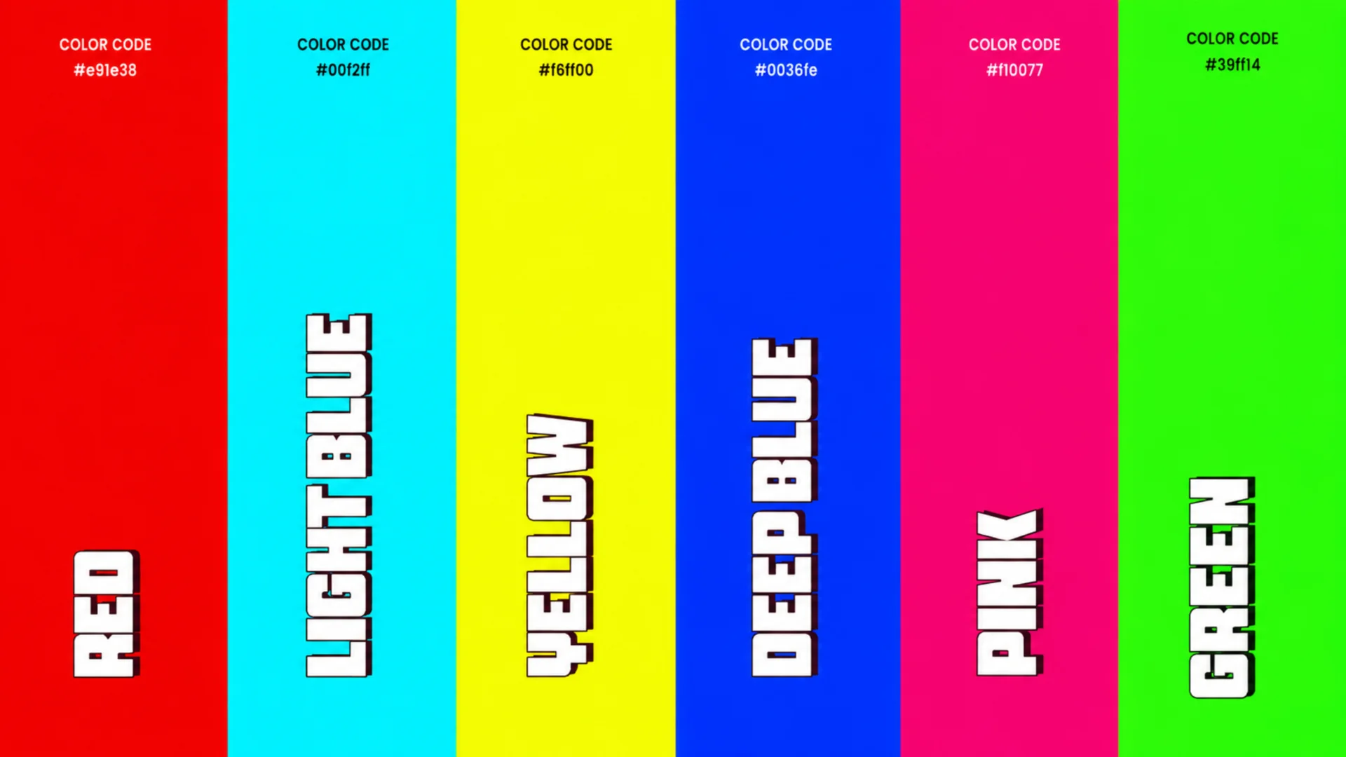
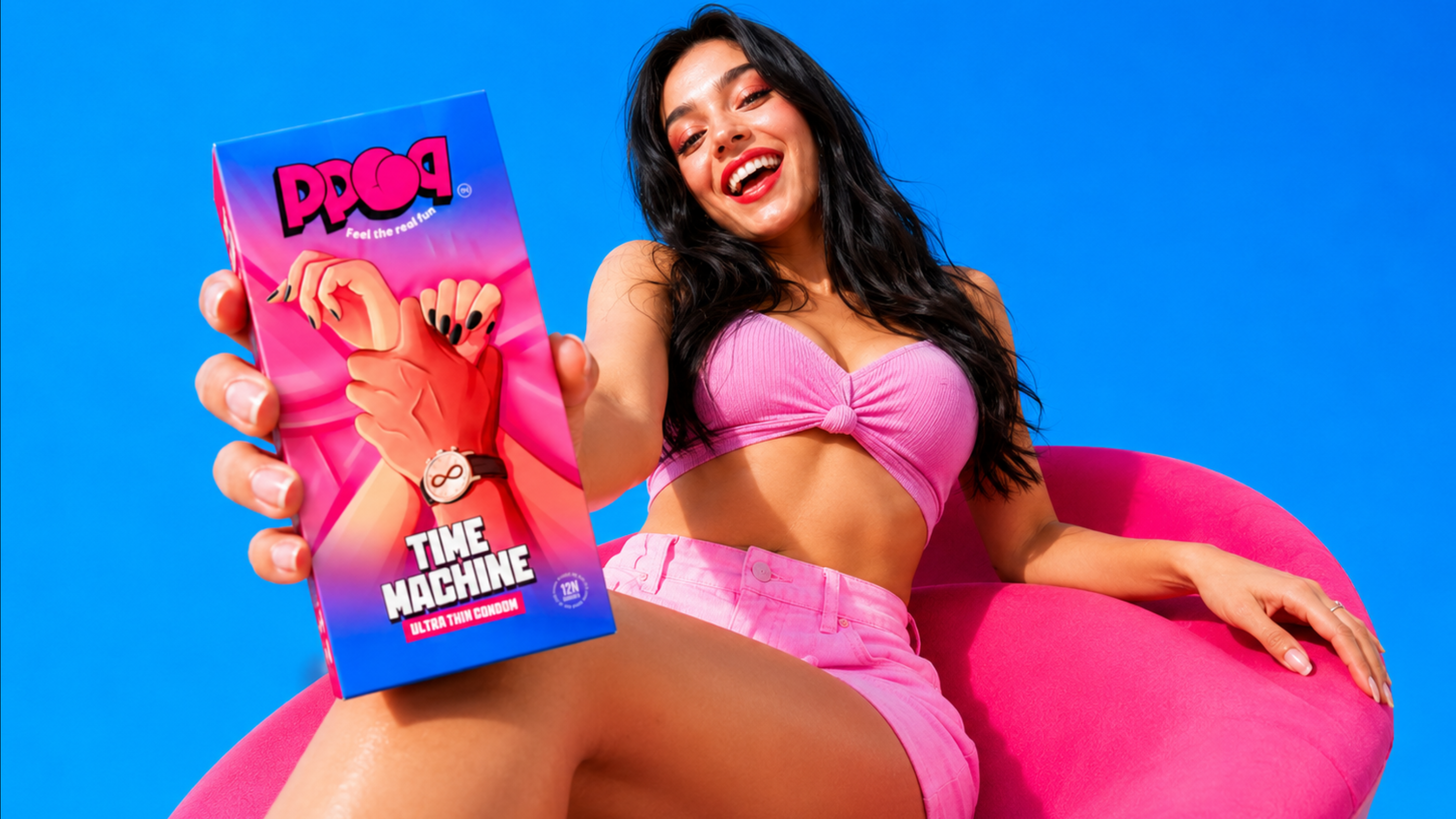
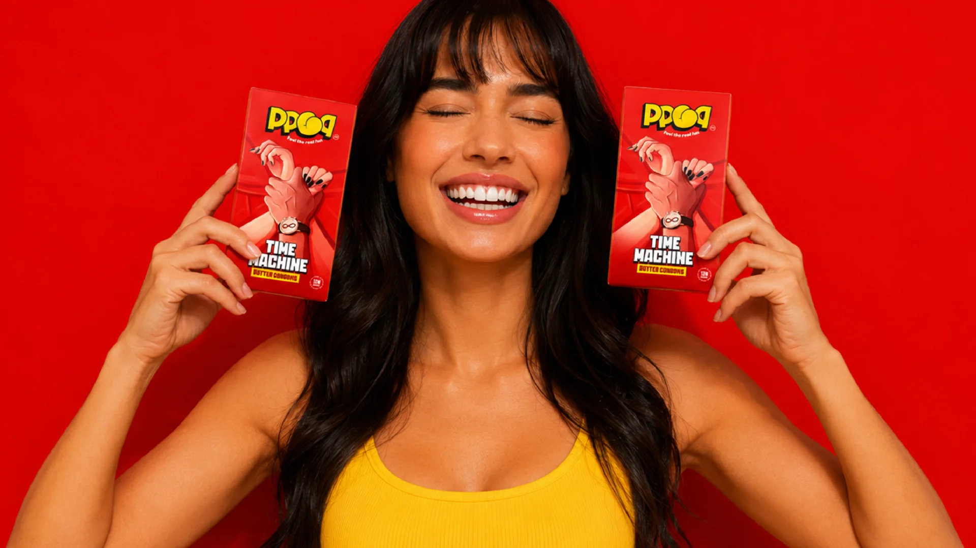
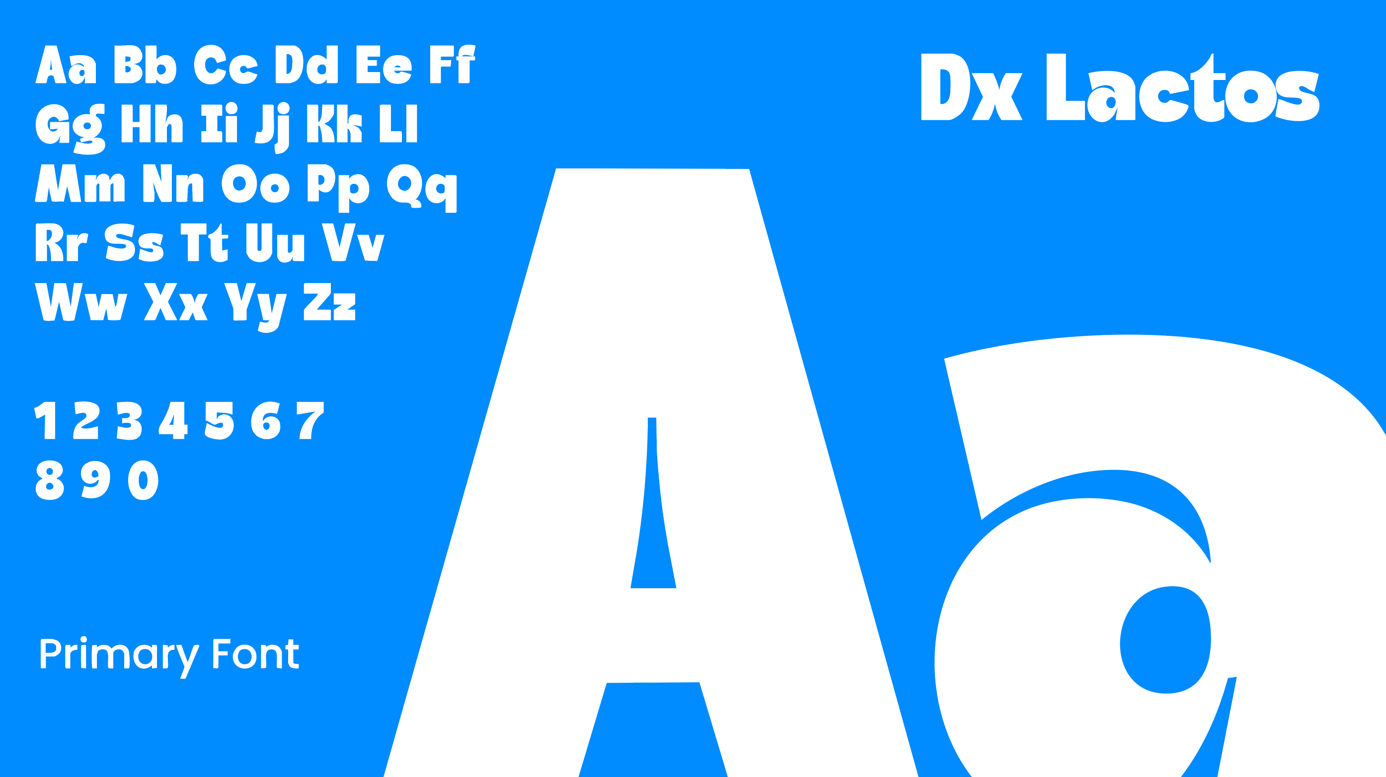
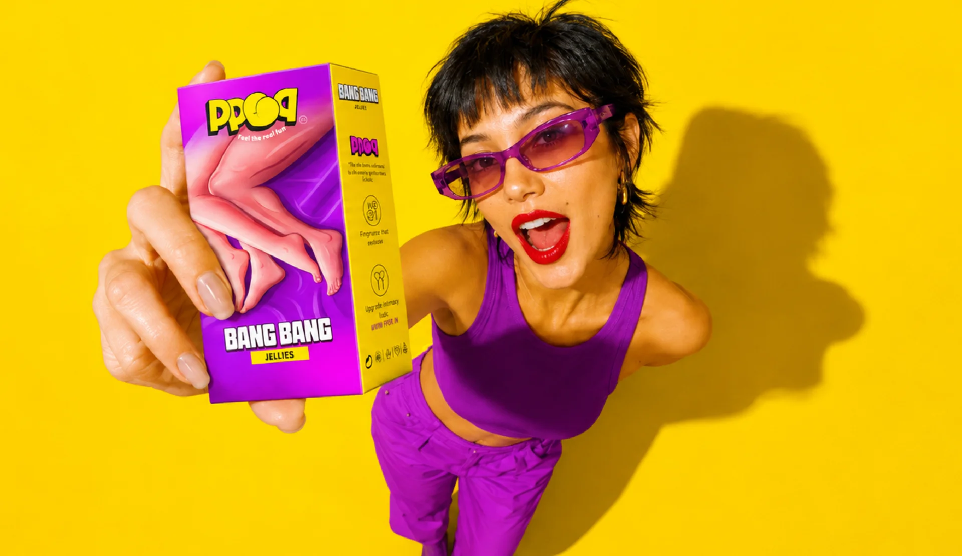
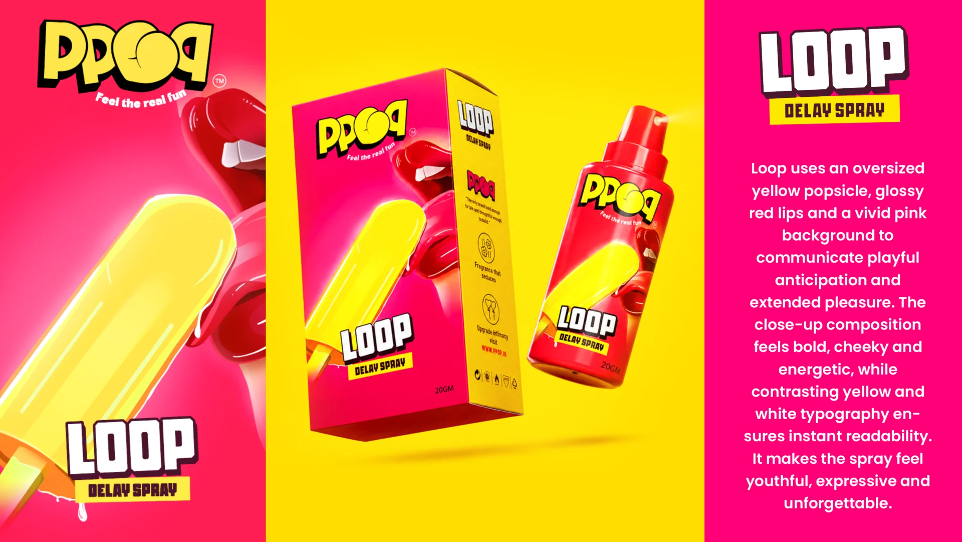
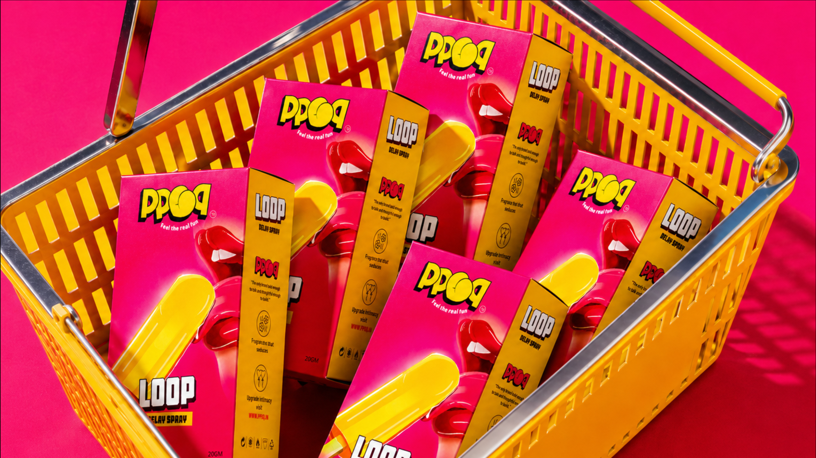
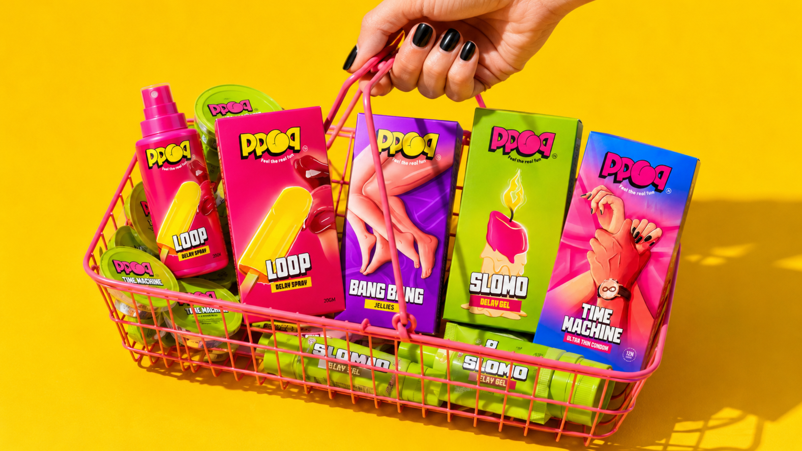
We built the brand around humour, confidence, and unapologetic self-expression. A bubbly, character-driven logo, saturated colours, bold typography, and cheeky pop-art illustrations transformed every product into a distinctive visual story. From packaging and photography to social media and campaigns, the system feels consistent yet flexible, turning intimate wellness products into expressive, collectible lifestyle objects.
“Made to break the awkwardness, designed to start conversations, and created to make pleasure feel playful.”
HAVE APROJECT IN MIND?LET’S TALK.
Tell us what you’re building and we’ll tell you, straight, what it could become. No pressure, just a real conversation about your brand.