
Goat life oats
What If GOAT Life Overnight Oats Was Reimagined?
What If GOAT Life Overnight Oats Was Reimagined?
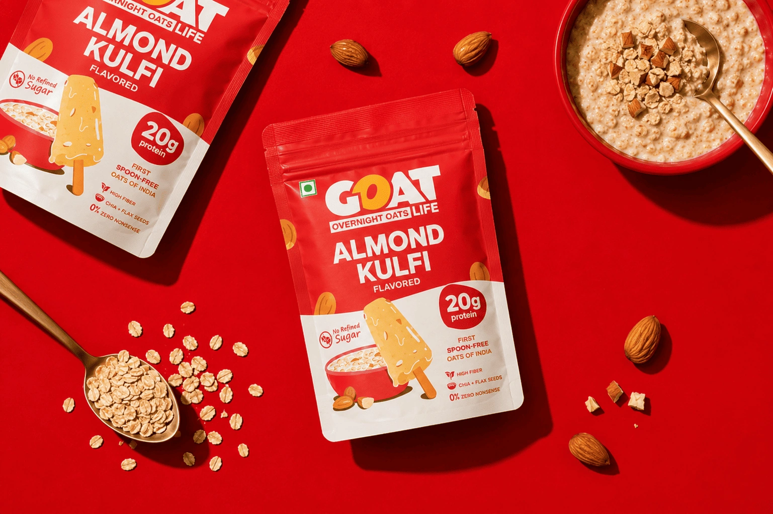
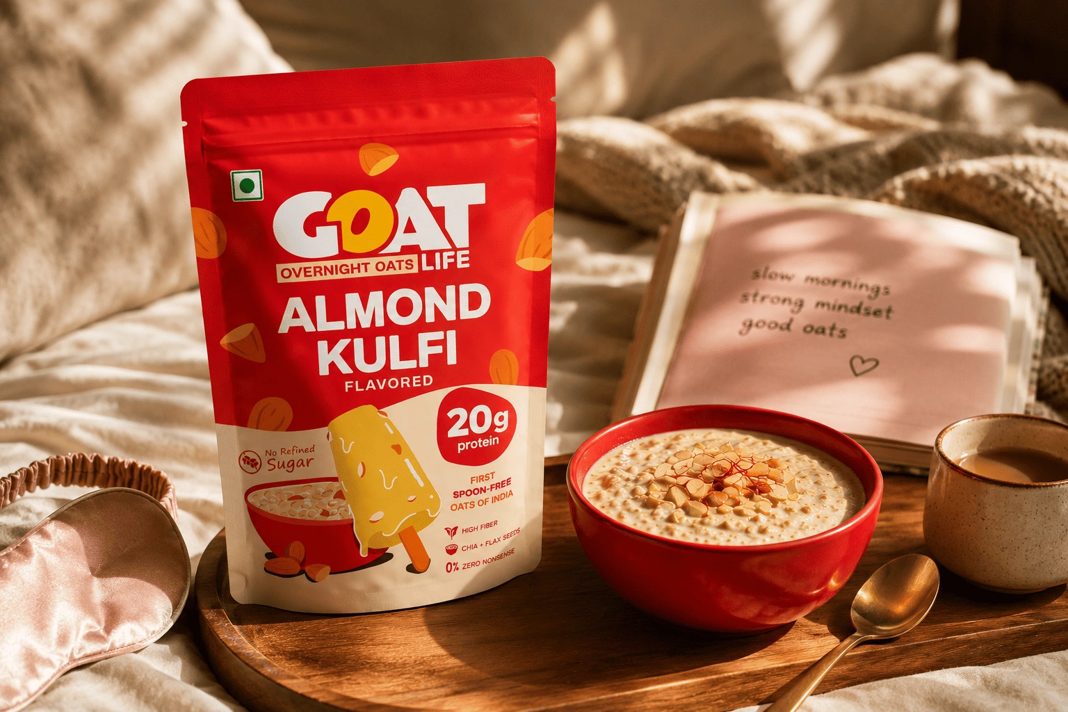
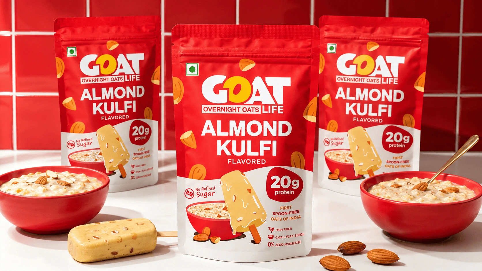
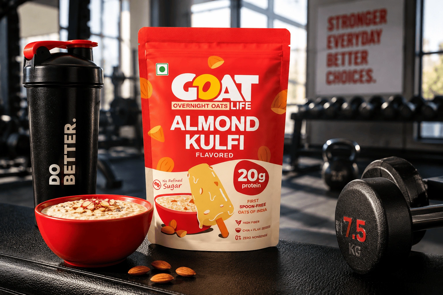
The original GOAT Life packaging communicated the product, but it felt cluttered, overly photographic, and lacked a strong visual language. In a category built around health, protein, and convenience, the packaging didn’t create enough shelf impact or emotional appeal for a modern, younger audience.
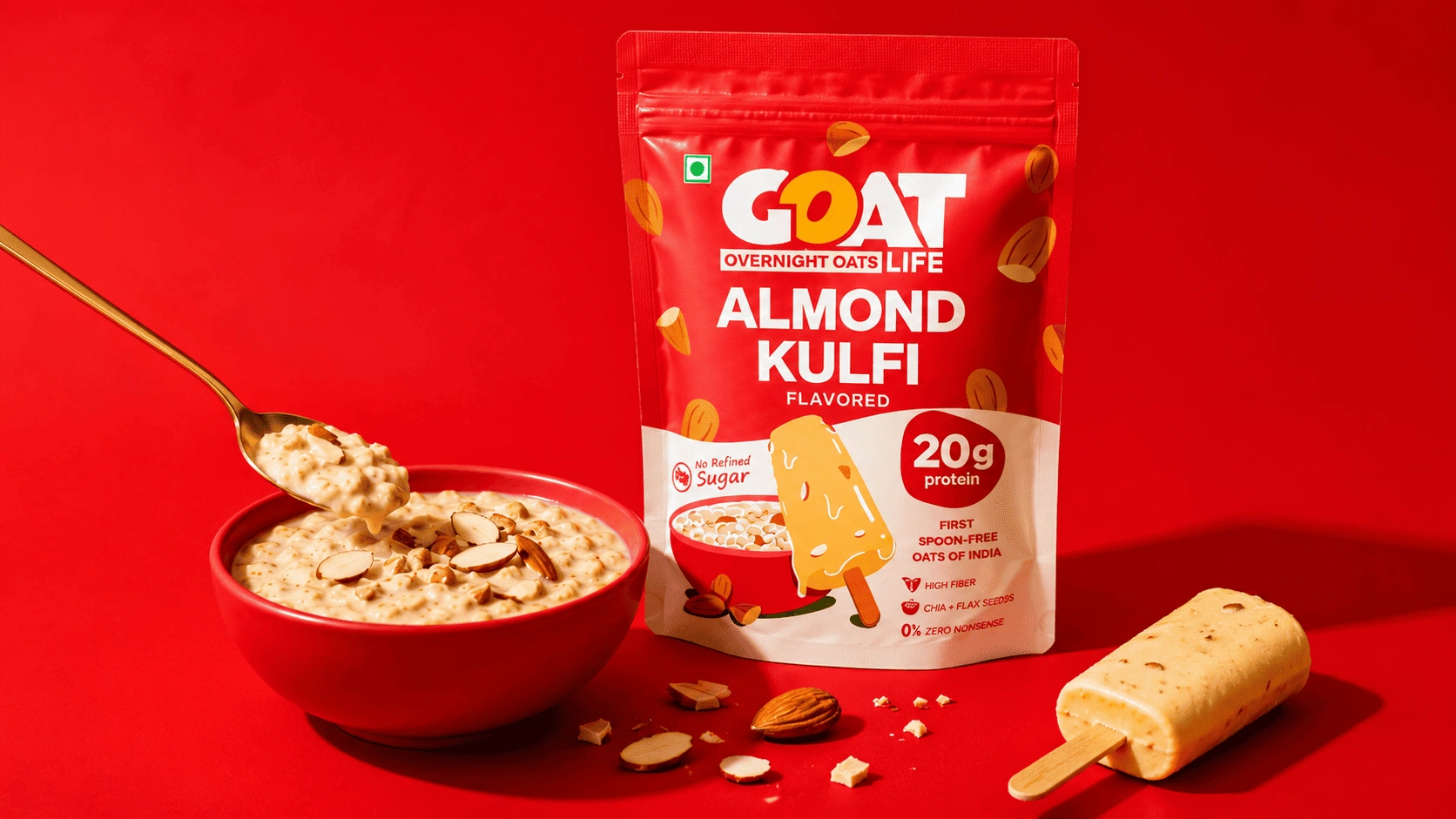
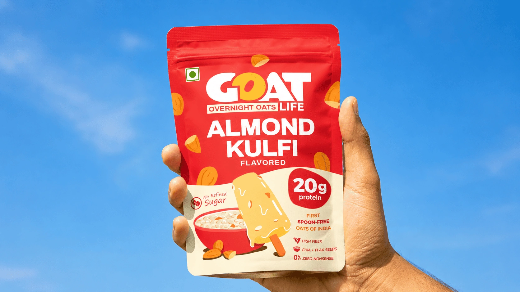
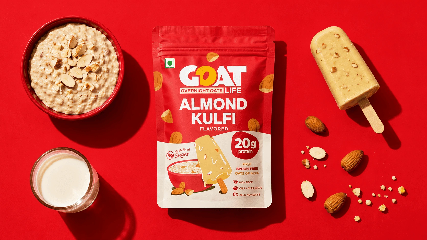
We reimagined GOAT Life with a cleaner, bolder, and more playful identity inspired by the nostalgia of Almond Kulfi and the ease of everyday breakfast. A strong red and cream palette, expressive typography, simplified hierarchy, and custom illustrations make the pack feel more memorable, appetizing, and contemporary while still clearly communicating its functional benefits like protein, fiber, and no refined sugar.
“Great packaging doesn’t just tell people what’s inside. It makes a routine product feel worth craving.”
HAVE APROJECT IN MIND?LET’S TALK.
Tell us what you’re building and we’ll tell you, straight, what it could become. No pressure, just a real conversation about your brand.