SUPERYOU: A WELLNESS BRAND WITH BITE.
Superyou wanted to look like a luxury brand and taste like a treat. We refused the usual wellness softness and built a chocolate-first identity instead.
 N°02
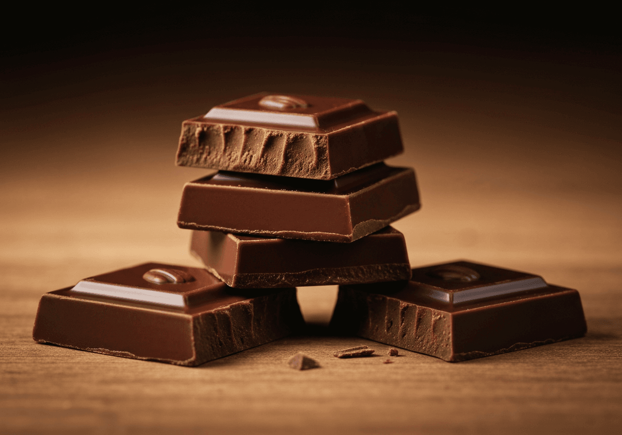
N°02Most wellness brands look like a yoga studio app. Pastel, breathy, vaguely apologetic. Superyou had something rarer: a product people actually liked the taste of. So we leaned into pleasure, not penance.
The system is rich cocoa-brown and gold, set in a confident grotesque with cinematic still-life photography. It looks like a luxury chocolate house — because that’s what it is, with vitamins.

The single boldest move: we banned the word ‘wellness’ from the brand. The product does the talking; the brand sells indulgence.
Outcome: SKUs that read as gifts on shelf, packaging that doesn’t need an ingredient sticker to sell, and a brand that finally matches what’s in the wrapper.

How does it land?