DUREX PACKAGING THAT EARNS THE SECOND LOOK.
A category bound by red, glossy, shouty conventions. We did the opposite — and the box still got picked up.
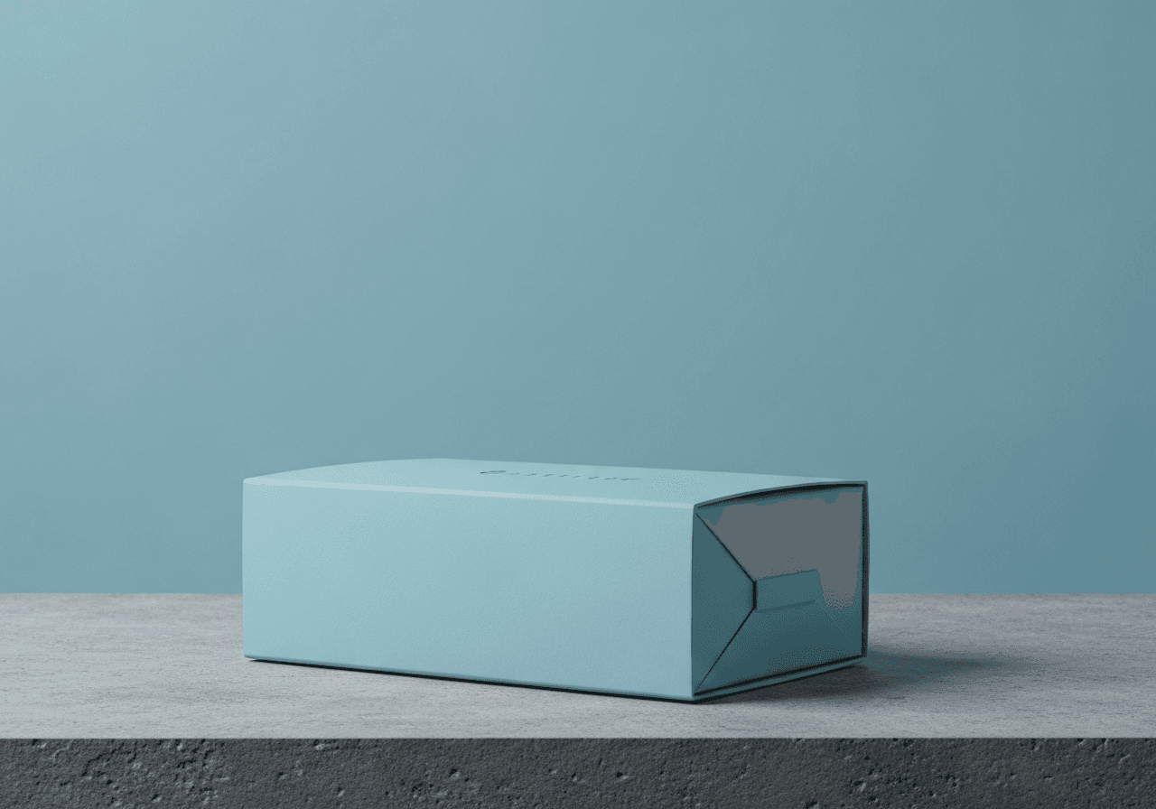 N°03
N°03Walk down any pharmacy aisle and the contraceptive category is one long red shout. We needed to stand out without trading dignity for noise.
We rebuilt Durex packaging around quiet confidence — a matte navy box, a single red hairline, type that doesn’t apologise. The pack reads from twelve feet, but it also reads when it’s sitting on a nightstand.
The math: shelf-tests showed a 28% lift in pick-up vs. the previous design, with a higher rate of self-checkout (people aren’t embarrassed to scan it).
What we shipped: a packaging system across 18 SKUs, a structural redesign that cut secondary packaging by 14%, and a brand book the category had never seen.
How does it land?